
July 7, 2026
In the last year and a half, a longtime client completed a significant brand overhaul that is, in a word, beautiful. The language, the fonts, the imagery, the graphic assets, and the colors are all deserving of praise, and undeniably move the company in a fresh, more contemporary direction. And yet, the new system almost immediately came up against a major hurdle.
The colors—a different one for each business unit—were chosen and approved based on digital output. No one had ever seen them in the real world, on physical substrates, until our team began printing samples. And it turns out, the blues didn’t quite match from one format to another. The purples weren’t exactly what the team thought they’d be. Some were too light for legibility. Others came out too dark. For an organization with an iconic color system, these variations were unacceptable.
The brand equity depended on precision.
This is what happens when brand and packaging color matching enters the process too late. When color is chosen and approved entirely in a digital environment, without physical prototyping in the loop, the gap between what a team sees on screen and what actually reproduces can be significant. The earlier color matching enters the process, the less expensive the problem is to solve.
Digital Color Drives Discovery, Physical Creates Proof
We live in an omnichannel world, where the buyer journey begins and often ends online. But tangible, hold-in-your-hands packaging is still the moment of truth for a brand and its expression. Does it deliver on the brand’s promise? Does it telegraph the brand’s values, and in turn, the consumer’s? Does it signal whether the product inside is worth the price? Does it delight, excite, and activate the all-important dopamine receptors?
Packaging has a massive job to do, and color is paramount to its responsibility. It dictates whether a brand stands out or recedes. Whether it feels ownable or like one of many. Whether it is consistent or disjointed. All of these create indelible impressions in consumers’ minds, determining whether a brand is instantly recognized or only partially recalled (or not remembered at all). This is why our client could not afford to allow even small color inconsistencies to reproduce at commercial scale. Too much had been invested in the brand overhaul, and too much was riding on its effective execution.
The commercial consequences of getting it wrong are real. Retailers notice color inconsistency across a product line, line reviews get complicated when packaging doesn’t match the approved standard, reprinting costs accumulate, launch timelines slip, and once inconsistent packaging reaches shelf, the damage to brand perception is difficult to quantify and nearly impossible to reverse.
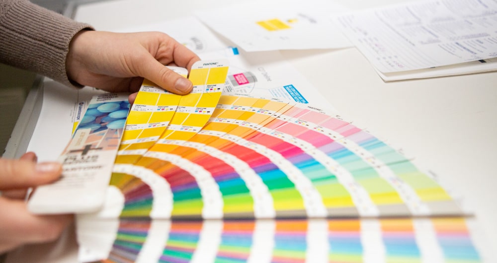
So their design team came to the Kaleidoscope studio—where our packaging color matching team’s expertise is second to none—and we printed dozens of variations of the colors on multiple different substrates, until we dialed into the exact right formula for precise reproduction, everywhere. We even helped them choose a new purple, among hundreds of options, to ensure the right symbolic communication as well as consistent printability.
Color Consistency Is Brand Protection
In an era when brands are moving faster than ever—launching new products, refreshing portfolios, and creating assets across an expanding mix of channels—it can be tempting to assume that a digital color specification is the definitive answer. In reality, it’s only the starting point. Every substrate, print process, coating, and finish influences how color is ultimately perceived. We often see color inconsistencies between suppliers, as well. Getting it right requires both technical expertise and an obsessive attention to detail, because the difference between “close enough” and “exactly the same” is often the difference between a package that feels unmistakably on-brand and one that subtly erodes years of brand equity. (Or worse, resembles a competitor’s brand, which opens a whole other can of worms.)
At Kaleidoscope, we know that packaging color matching is as much about protecting a brand as it is about reproducing one. It’s the discipline that ensures consumers experience the same brand whether they’re viewing a corrugated shipper, a folding carton, a flexible pouch, a can, a bottle, or a retail display. When every touchpoint speaks the same visual language, brands earn recognition, build trust, and create the consistency that makes consumer decision-making easy. Sometimes the most important decision isn’t introducing a new color, it’s making sure the one you’ve already chosen is exactly the one the world sees.
If your brand is navigating a refresh, a relaunch, or simply trying to get consistent color across a complex substrate mix, we’d love to talk.