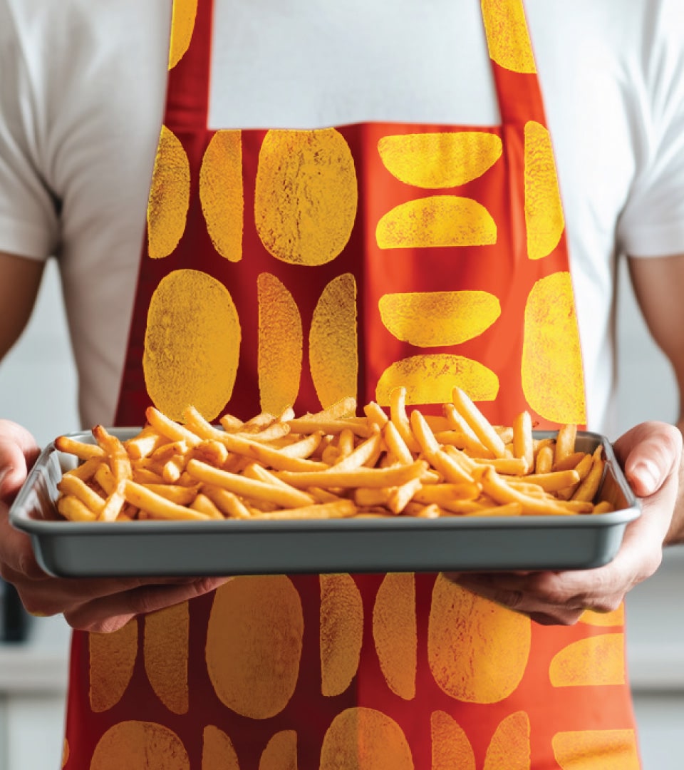
McCain
Easier to Shop. Easier to Enjoy.
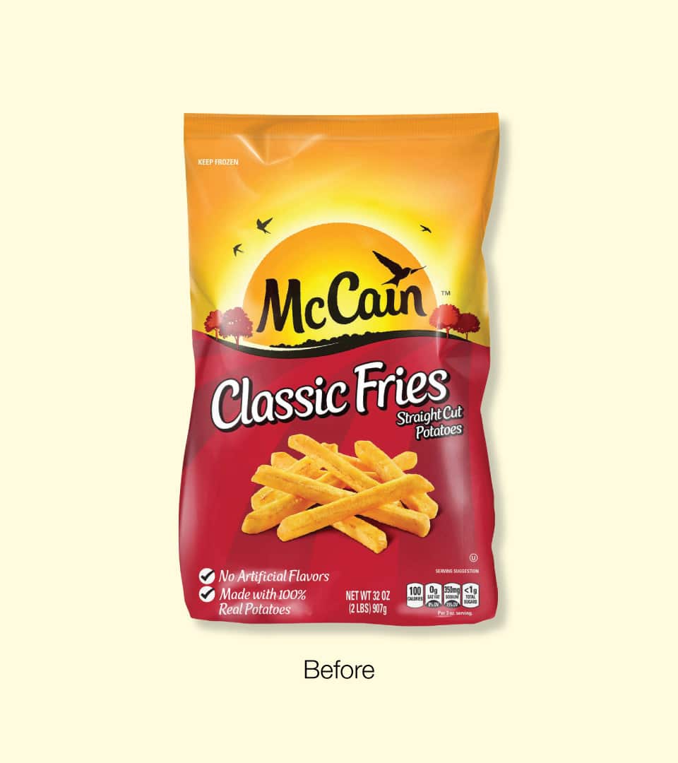
The Challenge
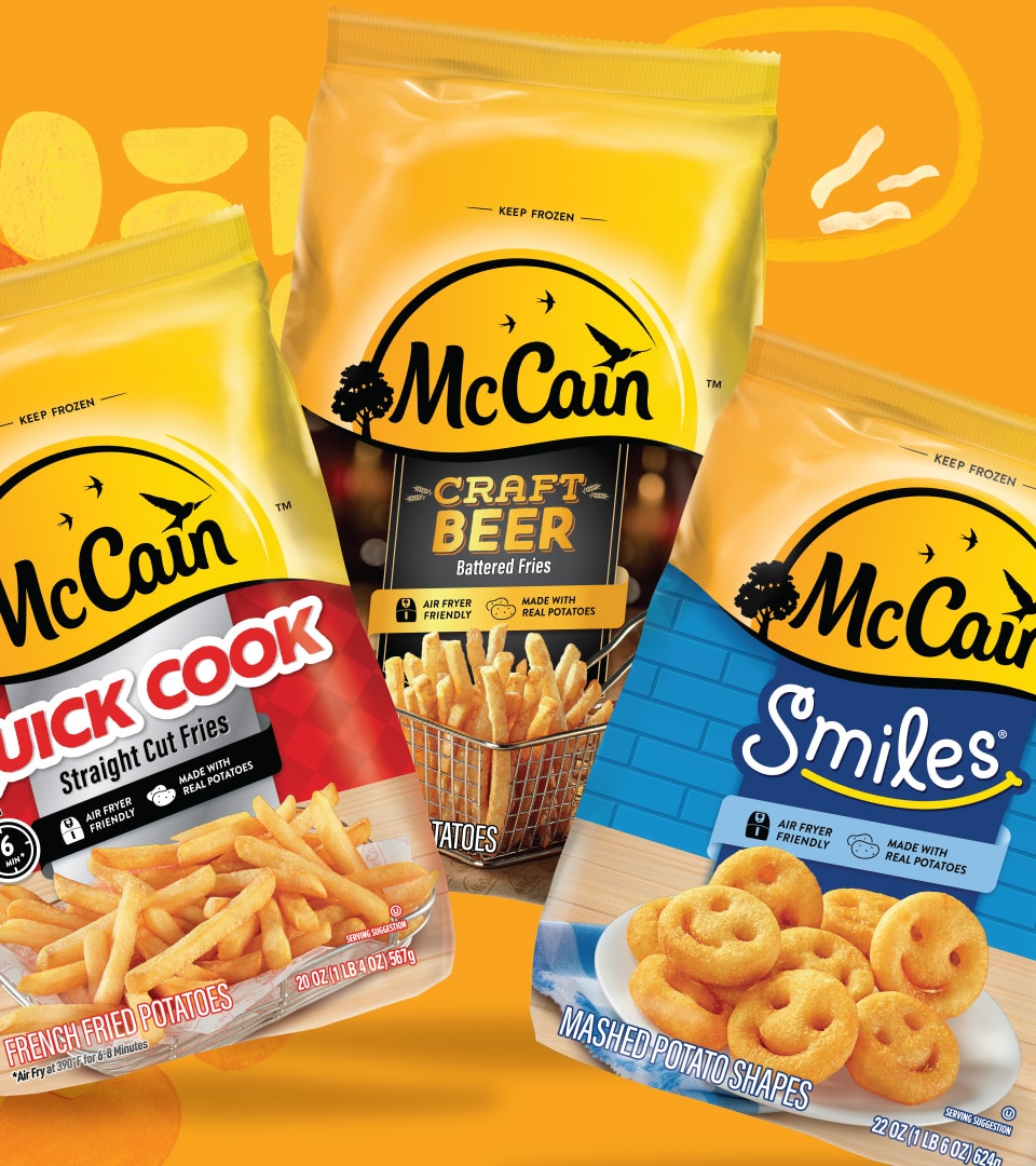
Frozen potato leader McCain had introduced a warm, energetic brand positioning built around irresistibly delicious food with the power to bring families to the table. The U.S. packaging hadn’t caught up. McCain needed a redesign that matched the new global identity, improved shopability across a broad portfolio, and clarified product pillars to drive stronger shelf performance.
Our Approach
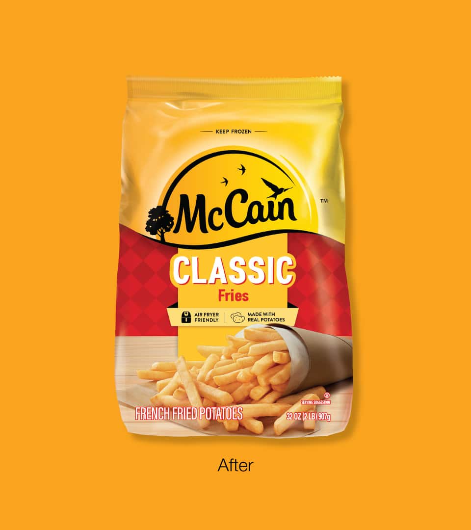
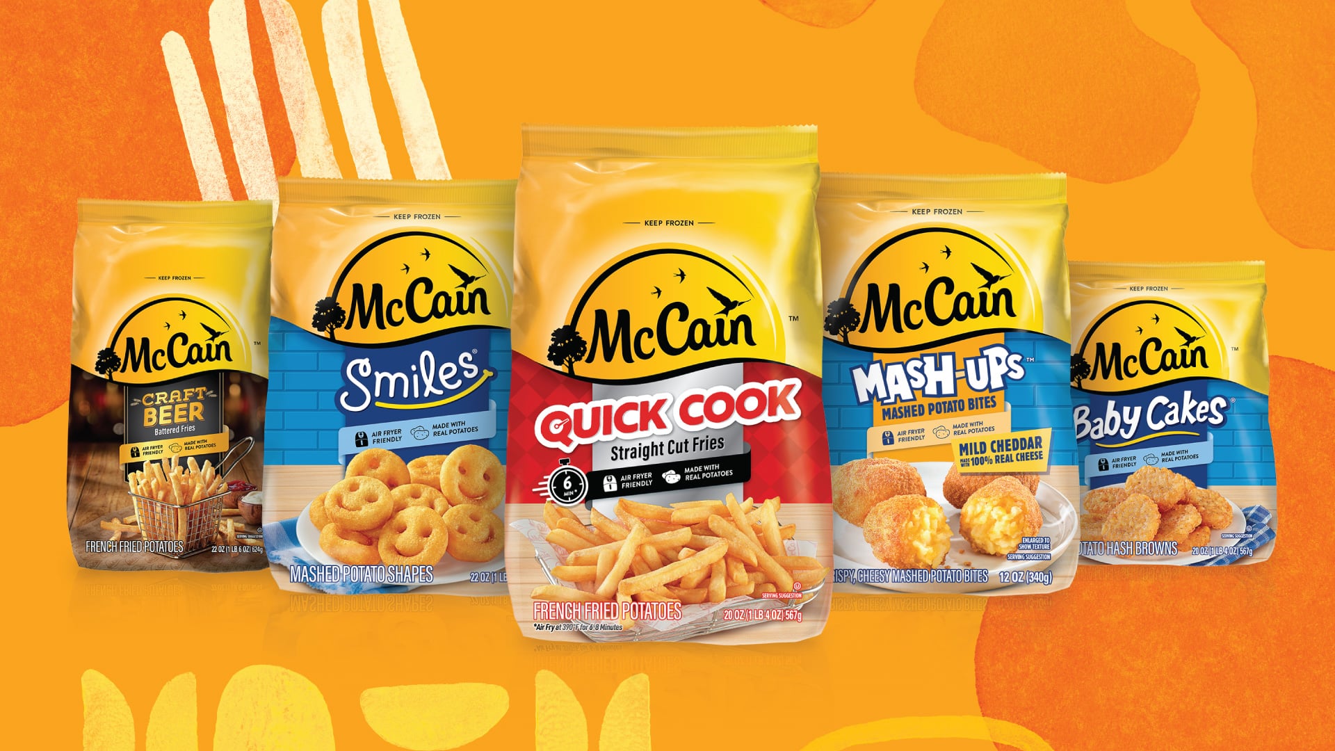
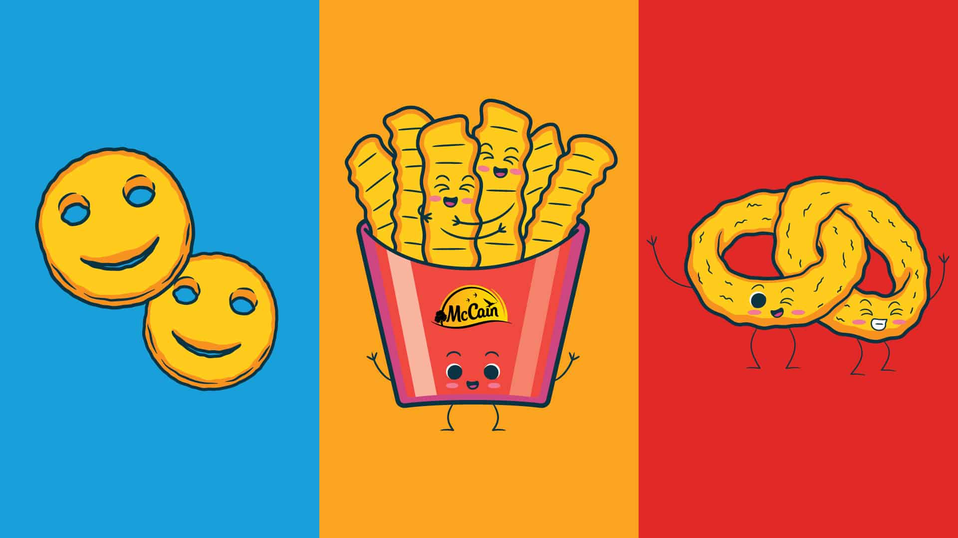
Working closely with the McCain team, Kaleidoscope delivered a packaging system that translated the global brand manifesto “Together is Golden” into a U.S. design that could earn its place in the cart. We improved findability and navigation across the range, making it easier for families to shop the full portfolio. Consumer research informed key decisions throughout, ensuring the redesign performed as well in testing as it did on shelf.
The Impact
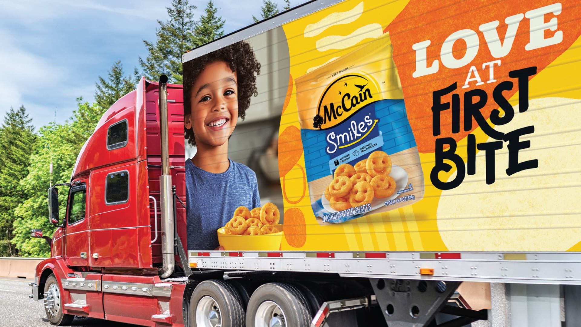
The result is a cart-stopping packaging system that elevates McCain’s shelf presence, strengthens brand equity, and positions the portfolio for long-term growth in one of the brand’s most important markets.
More Work
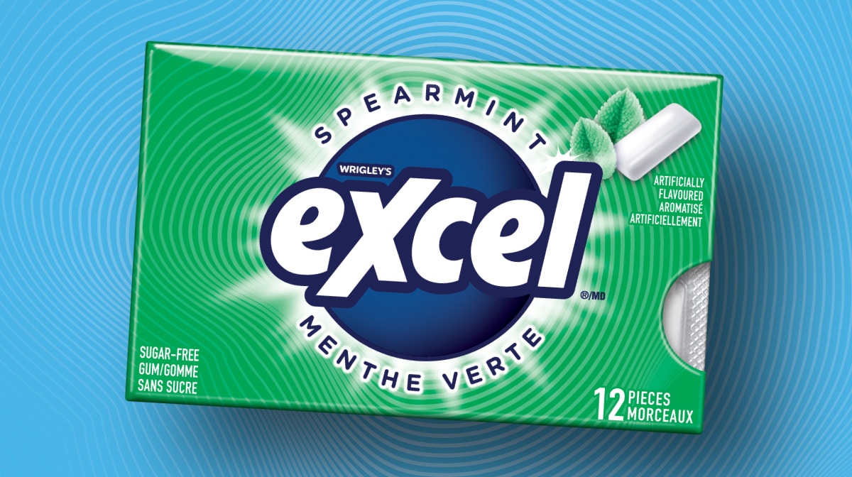
MARS Excel
Packaging Design · Consumer Research · Design System
A Gen Z-targeted redesign for MARS — 40 SKUs, bilingual compliance, and a scalable design system.
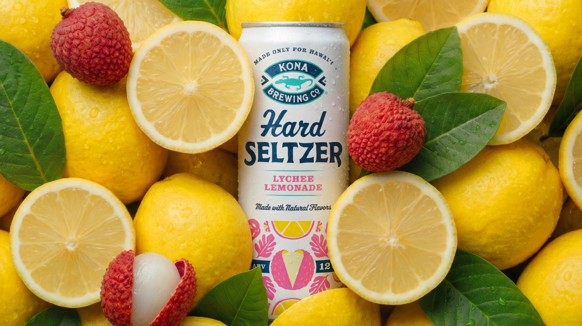
Kona Brewing
Design Strategy・Packaging Design・Visual Identity・Brand World Development
Sun, surf, and something cold. A hard seltzer line with packaging and a brand world built to match.
Get In Touch
Let’s Get Started
Every great project starts with a conversation. Have something in mind? Share a few details and let’s explore what we can build together.