April 17, 2026
Packaging design on a screen can look beautiful. But too many times, it just doesn’t translate in real-world environments.
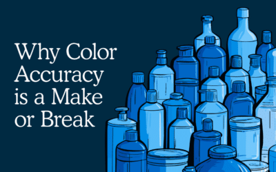
The color that looked so rich in the digital environment becomes recessive next to the competition. The light, airy fonts turn illegible under harsh fluorescent store lights. The photography that looked stunning in the comp becomes muddy on the production substrate. The window that was supposed to showcase the product doesn’t do it justice in three dimensions.
It’s one of the most common and most preventable reasons packaging underperforms in the real world. And it’s exactly why high-fidelity prototypes belong in your process long before a line review is on the calendar.
The Stakes Are Too High to Find Out at the Wrong Moment
Line reviews don’t often offer second chances. Retail buyers are evaluating your packaging against a competitive set, under real lighting, at real scale. That’s why packaging prototypes before the line review aren’t optional — they’re the only way to know your packaging works before the moment it matters most. A missed placement isn’t just a lost SKU. It’s lost velocity and lost momentum.
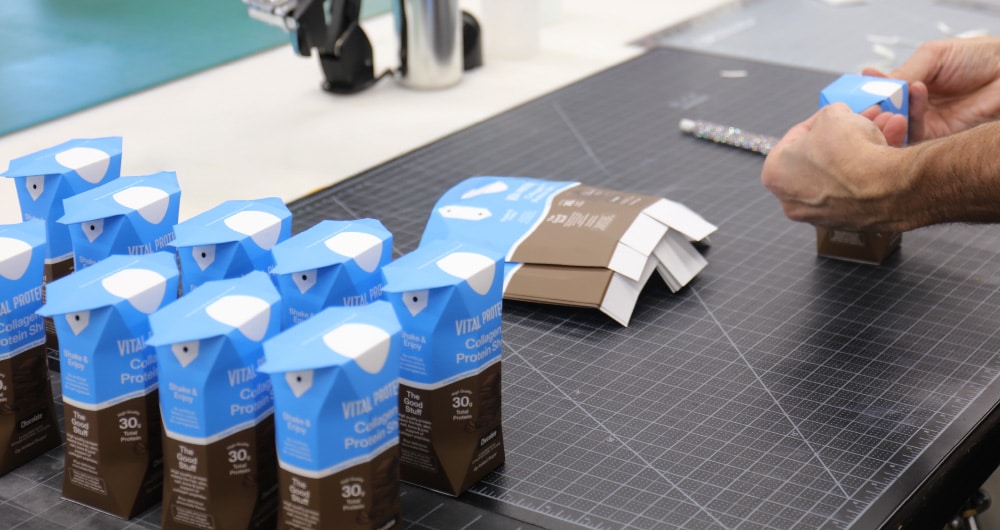
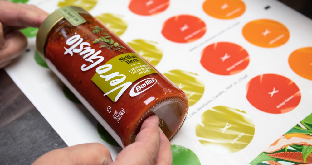
What Physical Prototypes Actually Solve
Most conversations about prototyping stay too surface-level. It’s not just about “seeing what it looks like in real life.” High-fidelity prototypes resolve specific, high-stakes questions:
- Does the color hold across different substrates and lighting conditions?
- Is the typography legible at shelf scale and from three feet away?
- Does the structure work as well in hand as it did in the rendering?
- Does the photography translate or does it flatten and lose appetite appeal on pack?
- Does the full system, primary, secondary, shipper, tell a coherent story?
These aren’t aesthetic questions. They’re commercial ones.
Why Kaleidoscope Is Built for This
At Kaleidoscope, our prototyping experts stress-test designs against real-world conditions: color matching for vibrancy and consistency across substrates, typography reproduction, photography fidelity on pack, and structural performance in hand.
We’ve done this for some of the most recognized brands in CPG across food, beverage, wellness, and beyond. We know what shelf-ready looks like. And we know the difference between packaging that earns placement and packaging that loses it.
Early is Always Better
The brands that win at retail aren’t the ones with the best digital files. They’re the ones who tested early, caught the problems before the line review, and showed up with packaging that performed exactly as designed.
Early physical prototypes are very often the difference between a product that sells and a product that sits.
Ready to see how your packaging holds up in the real world? Let’s build it.