June 11, 2026
Next month marks the convergence of two massive events for the United States: the 250th anniversary of our independence and games of the FIFA World Cup 2026™ happening right here in select cities (the World Cup technically starts this month, so please plan your workdays accordingly).
It’s one of the biggest opportunities for brands maybe ever—like, Big February Game level, except it only happens once every 250 years, like a comet. For Americans, the moment is also huge, and the BBQ’s and watch parties could be legendary. Social, streaming, and OOH marketing are blowing up—but as a packaging design and prototyping agency, we’re naturally invested in what’s happening on shelf. Specifically, whether brands treated this summer as the seasonal packaging opportunity it actually was, or whether they left it on the table.
About a year ago, we started wondering what America’s biggest brands would do for the semiquincentennial. Would they seize the moment and create new LTOs and flavors? Would the brand collabs knock us out? Or would they slap some stars and stripes on their everyday packaging for a couple of months before going back to business as usual?
A Look Back at the America250 Packaging We Predicted
Last September, we began researching brands’ plans for America250, leaning on our partners at Mintel and Canvas8. What we learned: nostalgia remains uniquely powerful; Americans are impossible to categorize (seems obvious); and nearly everyone agrees on the importance of family and community.
According to Canvas8, “Freedom remains one of the most enduring and unifying aspects of American identity. Although definitions of freedom may differ across political divides, its existence is a shared ideal that anchors people to a national identity that values independence and self-determination.”
Yet no one denies that tensions exist. We predicted that most brands would strike a celebratory note in their packaging. While there are no aesthetic guidelines, per se, we figured plenty would opt for “cheap and cheerful” while others chose “timeless and tasteful.” Our final forecast: how a brand’s America250 packaging comes to life will likely be more about what’s on brand for it versus any broader cultural trends.
The America250 Packaging We Actually Saw on Shelves
So were our predictions right? Mostly, but with some real surprises. Here are the themes we saw over and over, and our honest verdict on which brands made the most of the moment from a packaging design standpoint.
Nostalgia Forever
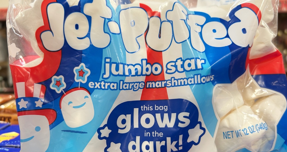
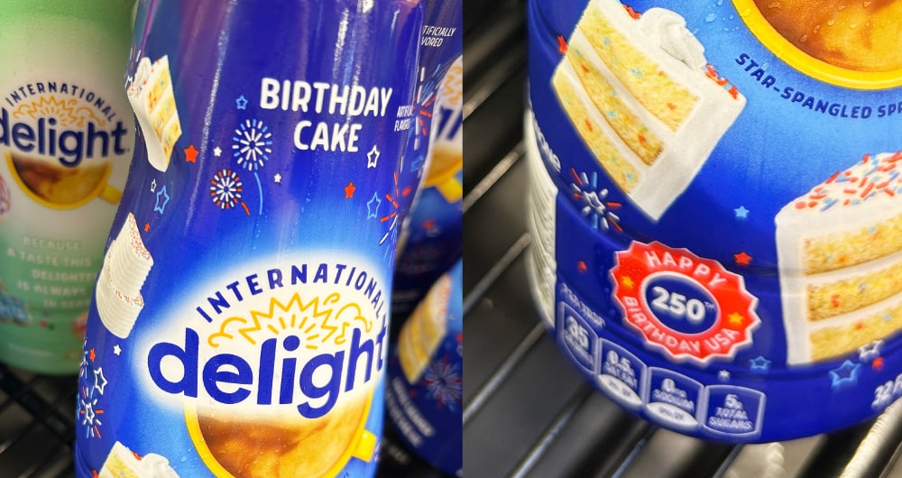
It’s a perma-trend because it hits us right in the feels. From graphics to type, this packaging took us back to being kids in America again, jumping through sprinklers, eating hot dogs, lighting sparklers, and catching fireflies (and also dodging mosquitoes, rubbing aloe on our sunburns, and scorching our marshmallows but hey, that’s childhood).
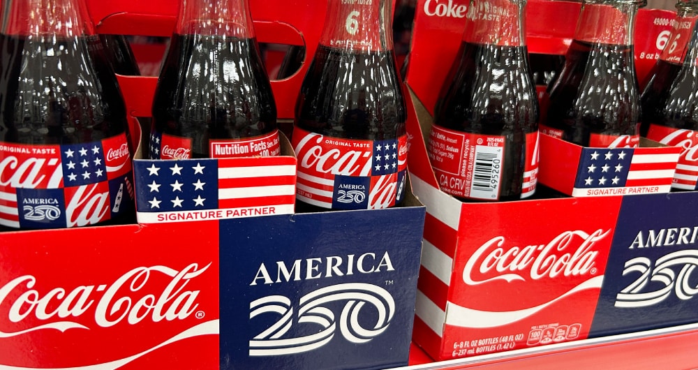
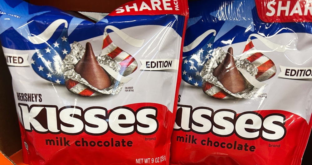
Big Fireworks, Bigger Stars
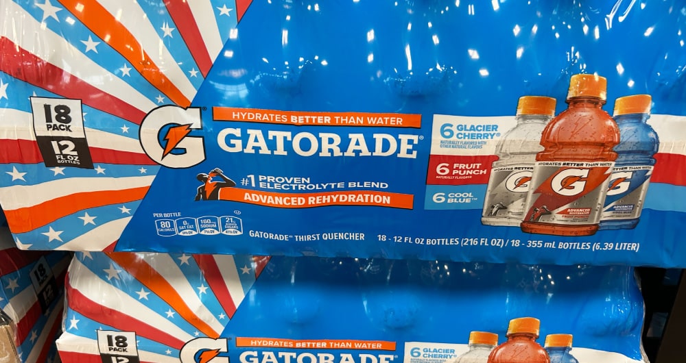
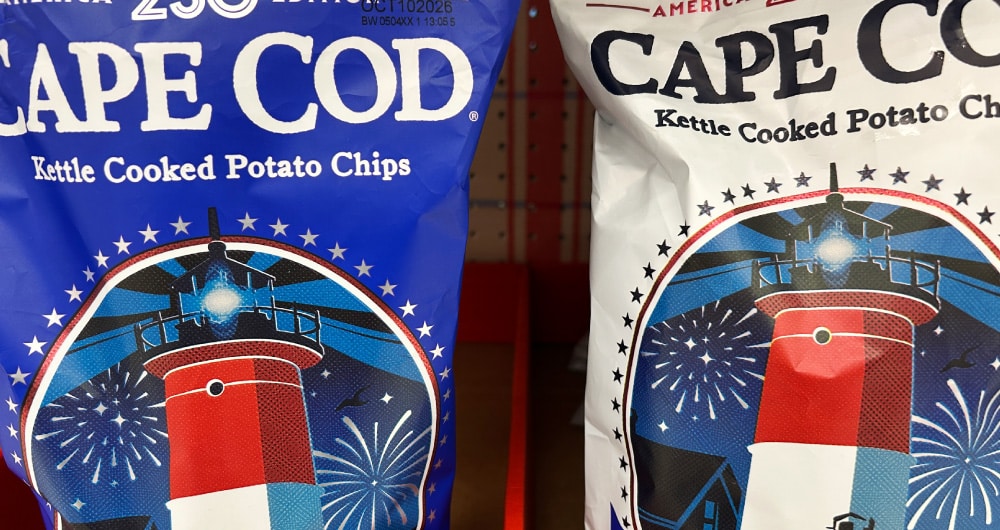
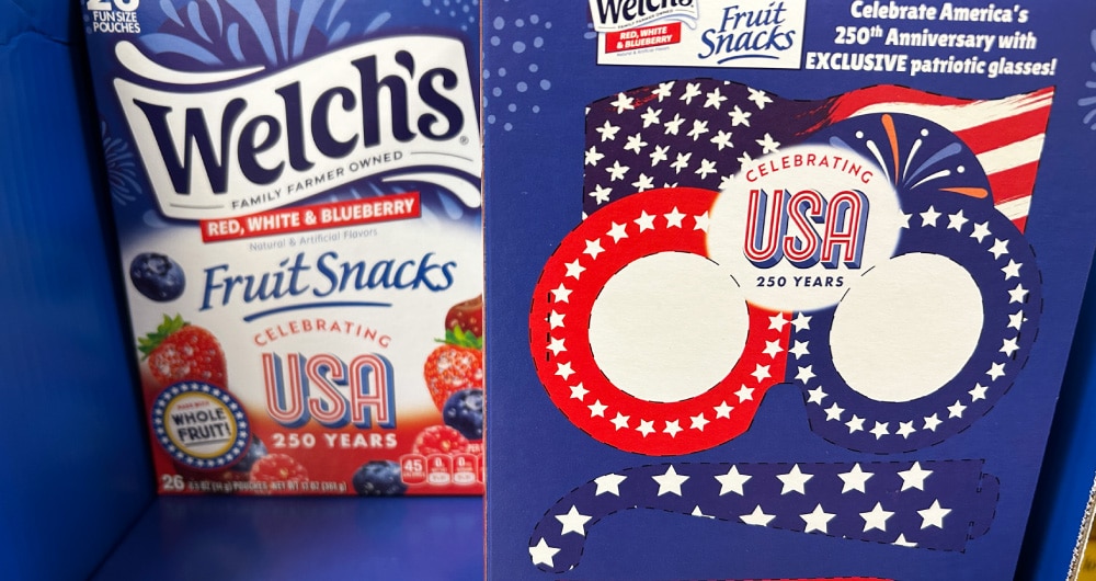
America’s ubiquitous Fourth of July symbols were EVERYWHERE. While stars, stripes, and fireworks are indeed very patriotic, they’re also a little…expected. The design question was never whether to use them, it was whether to integrate them or just apply them. Seasonal design works best when it’s genuinely woven into the design system—such as Cape Cod—rather than slapping artwork onto existing packaging (offenders will go unnamed). When it’s done right, the limited edition packaging feels like a natural extension of the brand… different enough to stop you and familiar enough to earn your trust. And Welch’s was the only pack we saw with an interactive element, a nice touch for its intended kid users.
Patchwork Americana
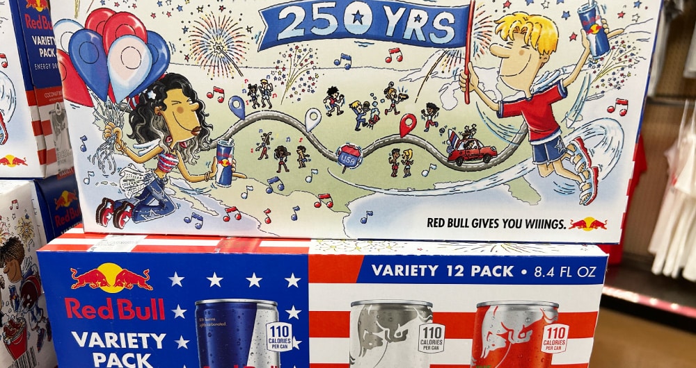
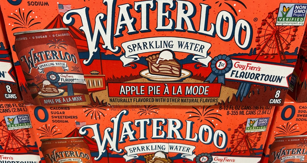
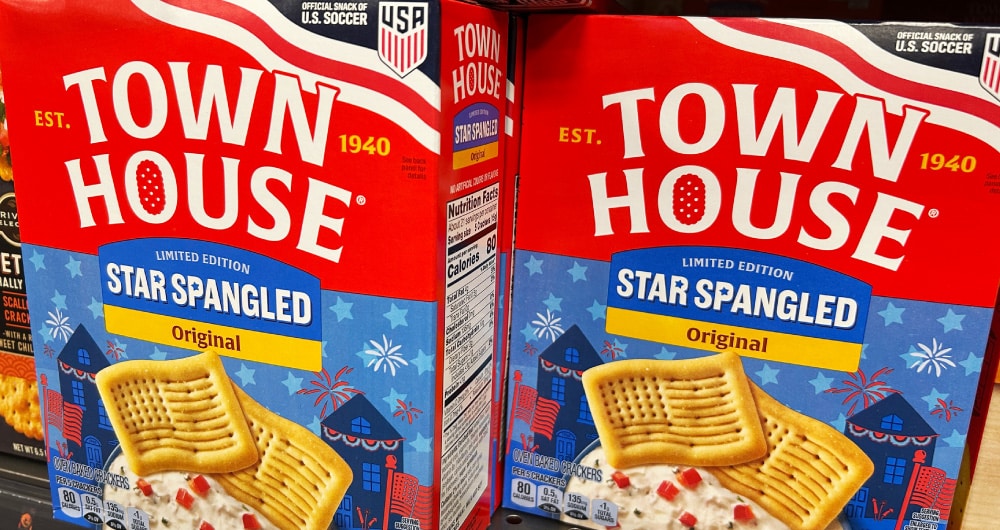
This design style does fall under nostalgia, but there was so much of it, we gave it its own category. Depicting iconic American scenes (Main Street, parades, a Ferris wheel, the flag, even apple pie), these tableaus felt very brand-right for those packages on which we found them. We were particularly taken with the Red Bull drawings, so in line with their overall marketing yet unique to this celebration. (Also, the Town House pack refresh is accommodating seasonal varieties SO well, and is one of our favorite new design systems of the year. It’s also a great example of what a well-built design system actually enables — flexibility without fragmentation. When the architecture is right, seasonal variations become an asset rather than a disruption.)
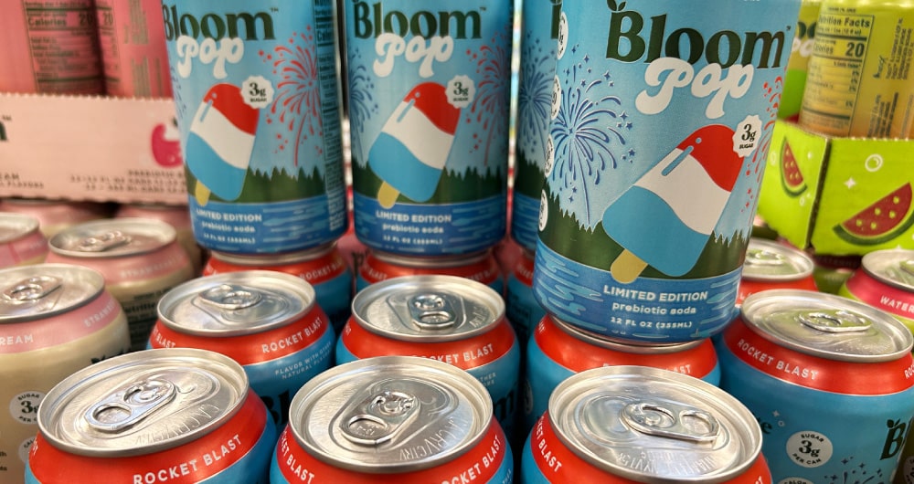
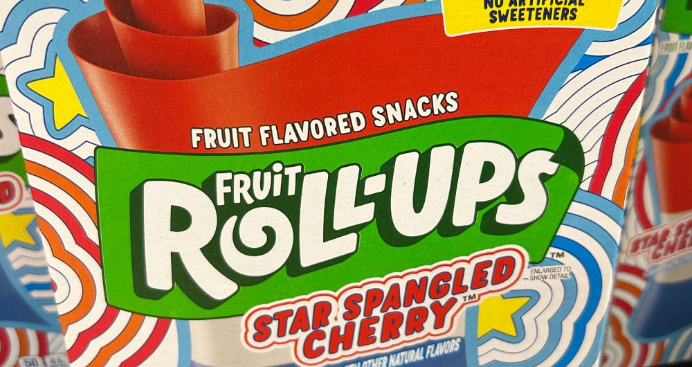
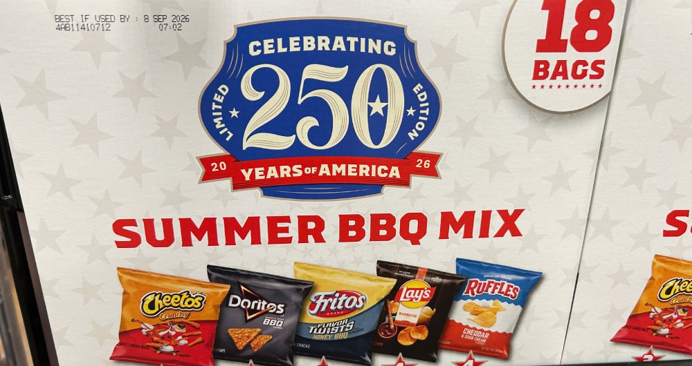
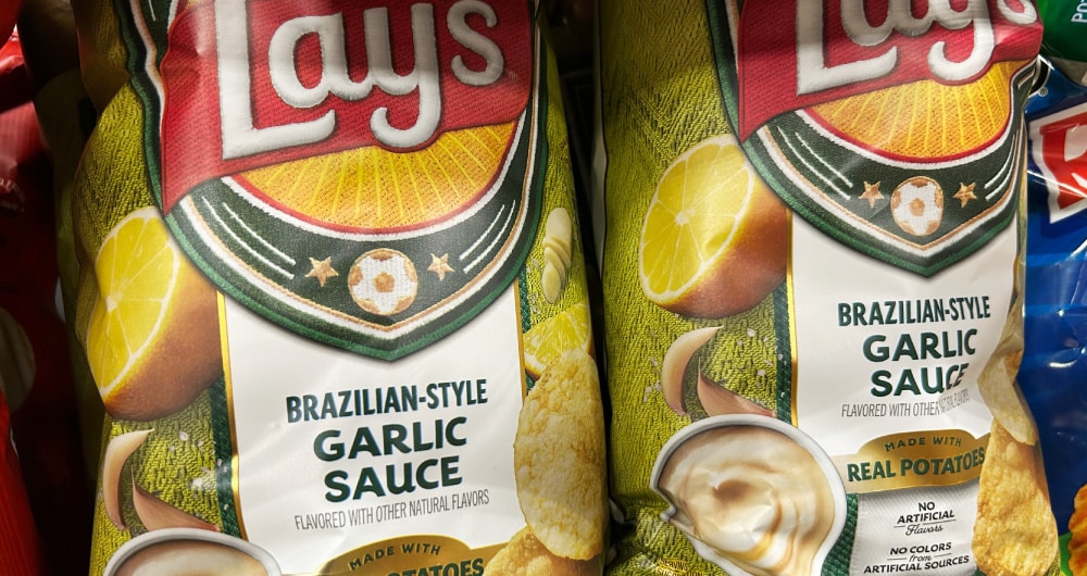
Celebratory Flavors
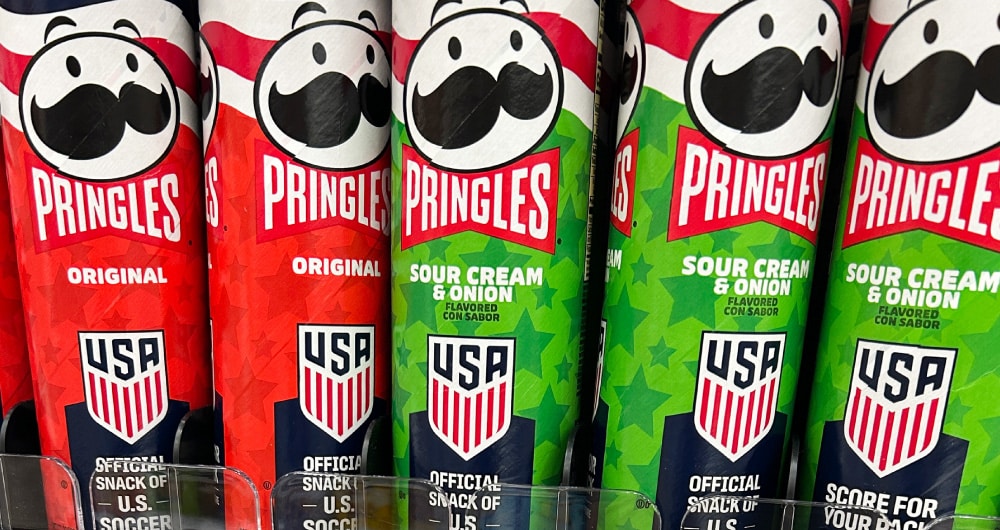
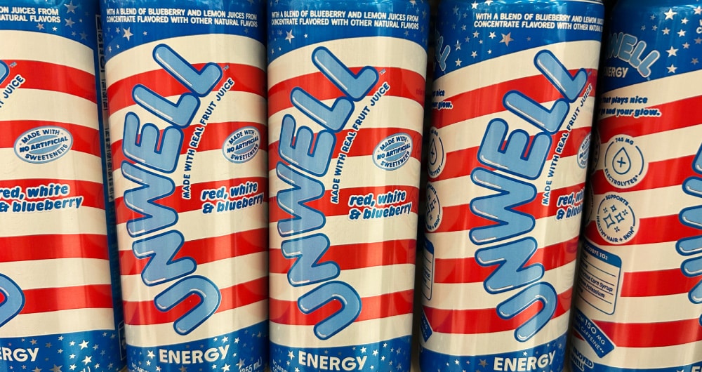
These felt less considered than we hoped, especially from a design standpoint, although the Lay’s World Cup varieties are an exception (sadly, the store did not carry Argentinian Steak with Chimichurri). We really thought we might see new flavors for America250, or at least more unique iterations than “Red, White & Blueberry.” Limited edition flavors are one of the highest-ROI moves a brand can make around a seasonal moment for driving trial and creating retailer excitement.
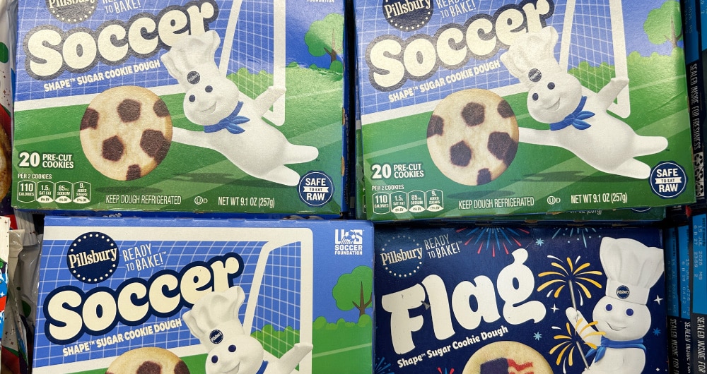
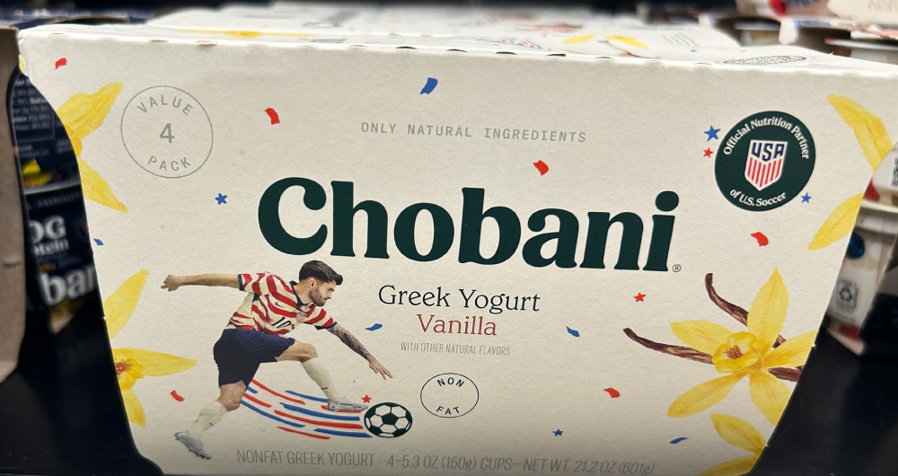
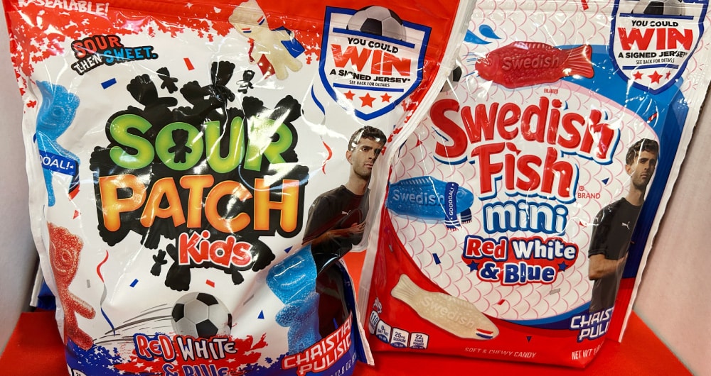
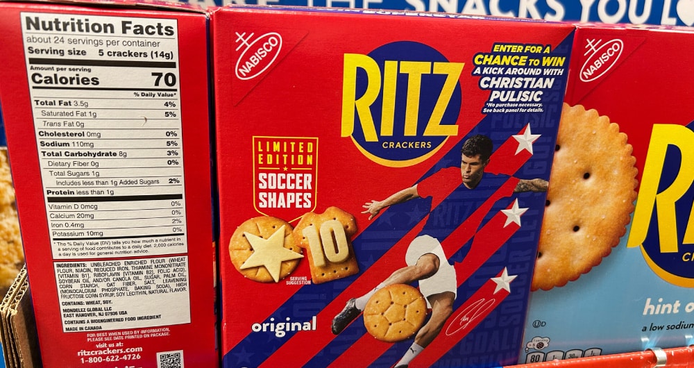
Christian Pulisic
Apparently he is the only U.S. soccer player to exist. Can we get some representation for the rest of the team, too? To be fair, Chobani has given other men and the women some visibility, but they are a massive team sponsor. Ritz is the only design working hard here (except for whoever carved that #10 out of cheese), but here’s hoping this isn’t the last we see of soccer branding in the U.S. The World Cup is a legitimate on-shelf opportunity, and the brands that built intentional packaging programs around it rather than just licensing an athlete will have something to show for it.
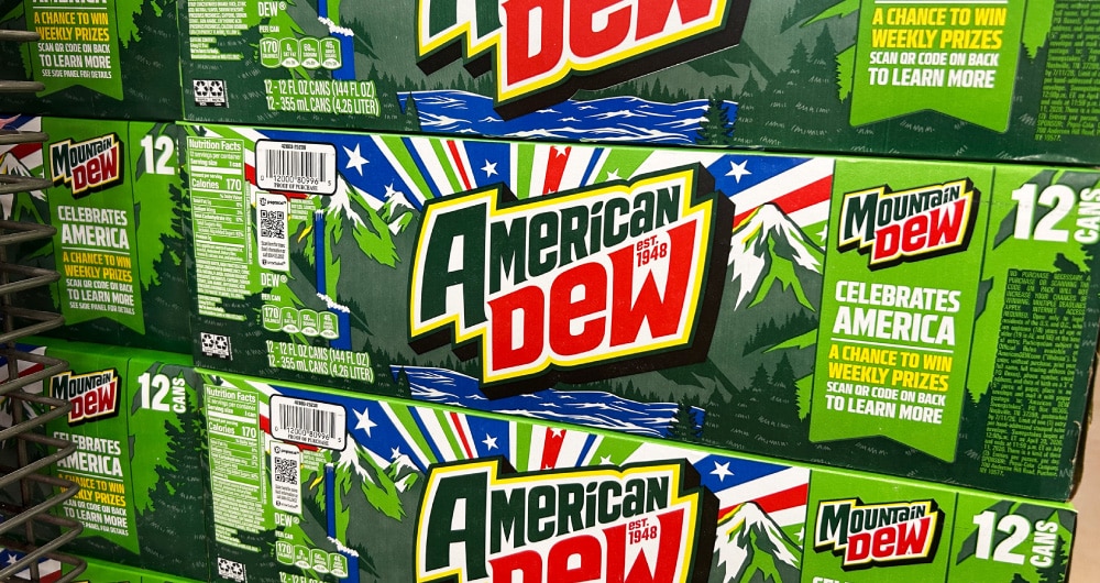
If We Had to Choose an America250 Packaging Champion…
Twist our arms, but it has to be Mountain Dew. This packaging is so over the top and so on-brand for Dew and its core consumers, it’s like meta branding. It’s not even Mountain Dew, it’s American Dew. This is a beverage that could only come from here, and love it or hate it, this package (and all the genuinely innovative flavor varieties Dew is spawning) will stop you in the aisle. It’s just a whole lot of things on one pack, and yet somehow it works. America’s 250th birthday is not the time to be quiet—and Mountain Dew knows how to be loud.
What Mountain Dew got right is what the best limited edition packaging always gets right: it’s completely, unmistakably them. The brand didn’t borrow someone else’s version of patriotism, it made its own.
America250 Packaging: Total Score or Missed Opportunity?
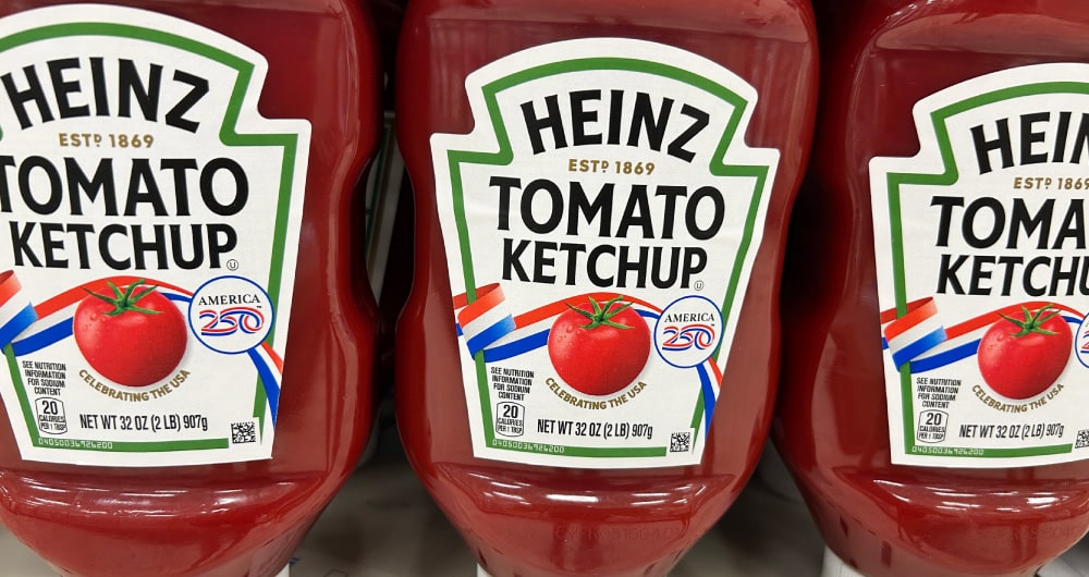
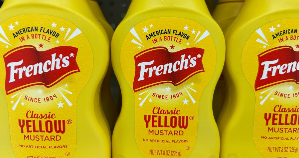
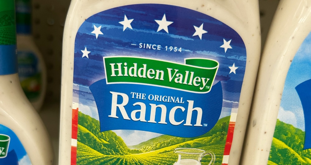
Some brands—Red Bull, Waterloo, Cape Cod—embraced the moment and gave us interesting, limited-edition packaging befitting a summer to remember. For others, especially in the condiment and snack aisles, the packaging was a letdown, at a time when we expected brands to invest in something special (and capitalize on the real revenue-generating potential of this summer’s unique celebrations). Even the paper products, those picnic staples, didn’t produce anything of note.
And that missed opportunity isn’t just aesthetic. Intentional seasonal packaging strategies are one of the most underleveraged tools in CPG. When it’s built strategically into the design system from the start rather than treated as a last-minute overlay, limited edition packaging drives trial, creates genuine excitement, and gives brands something to talk about beyond the product itself. The summer isn’t over, and neither is the conversation about what seasonal packaging can do for a brand. If you’re thinking about what yours could be doing differently, we’d love to talk.