
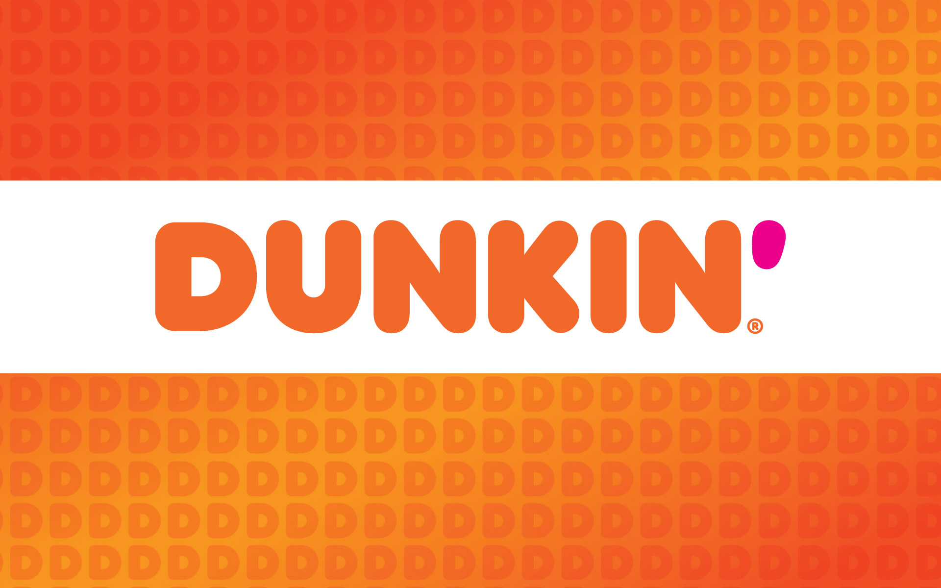
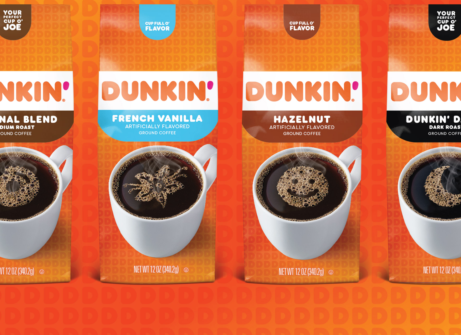
Dunkin’
A Smile In The Mind & In Your Cup
In a move as bold as their roasts, Dunkin’ dropped the Donuts from their brand name and needed a new retail design to match. Recognizing that consumers turned to Dunkin’ not only for donuts but also for a delicious range of coffees, the updated retail design needed to signify this next step for this iconic American brand. The challenge was striking that balance between a contemporary take on appetite appeal with the familiar brand assets that consumers identify as Dunkin.’ The final design that hit retail shelves involved an ownable illustration style that dually communicated bold flavors and the fun personality cues that make Dunkin’ such a beloved brand. With a consistent design architecture that can stretch across flavors and seasonal strategies alike, Dunkin’ is well-positioned for growth and to keep America runnin’.


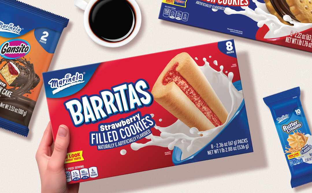
Marinela
Marinela Expanding horizons.Staying true to tradition. To grow its presence in the U.S. market, Marinela set out to reach a broader audience without alienating its loyal Hispanic fanbase or losing the brand’s iconic heritage. That meant evolving its packaging system...
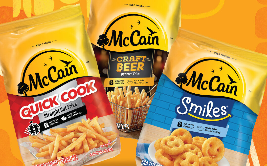
McCain
MCCAIN Easier to shop. Easier to enjoy.Because Together is Golden. After introducing a warm, energetic new brand positioning overseas, frozen potato leader McCain recognized the need to redesign its U.S. packaging to match—while also enhancing shopability and...