
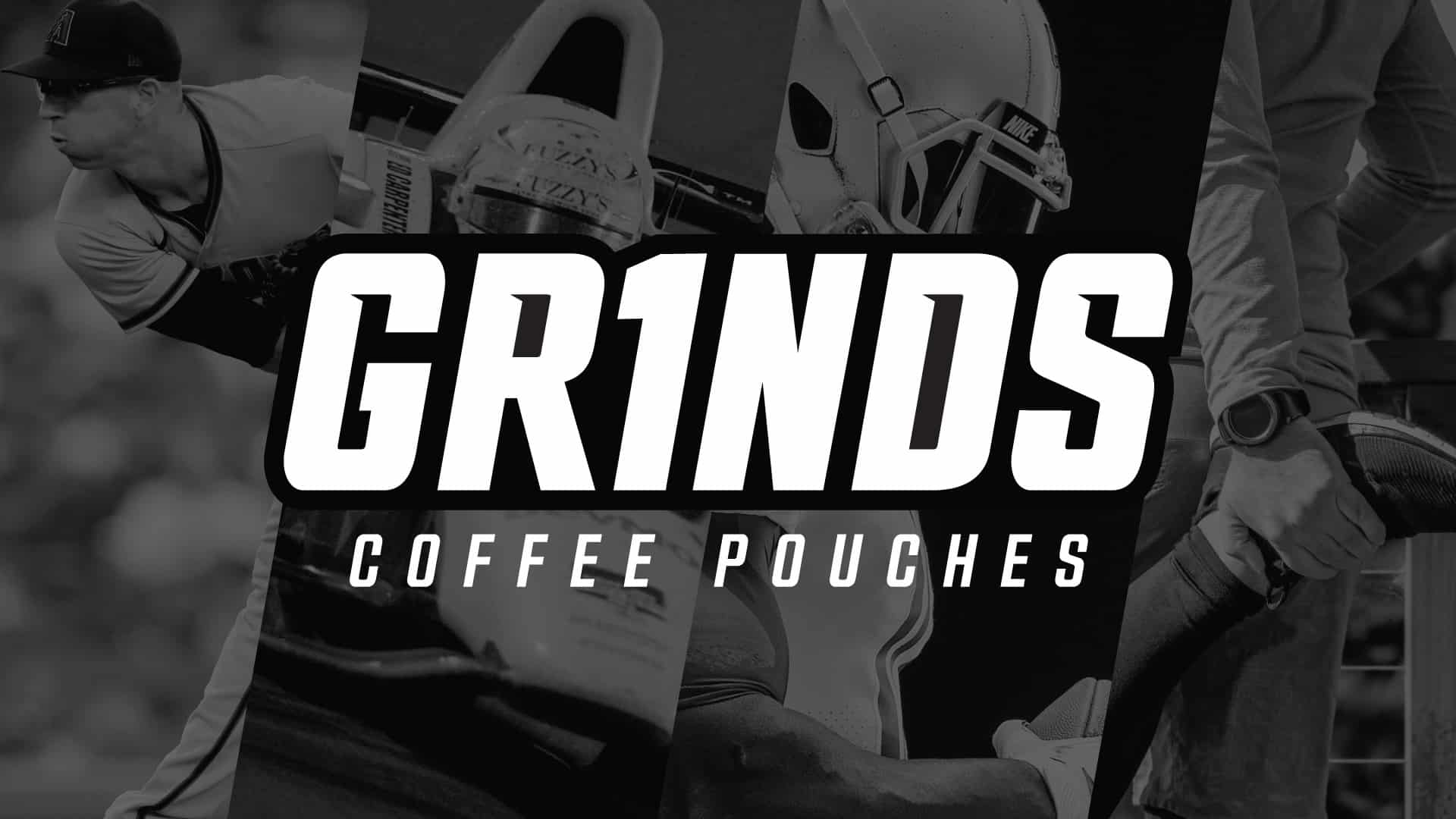
Grinds Coffee Pouches
Branding for Better Habits
The Challenge
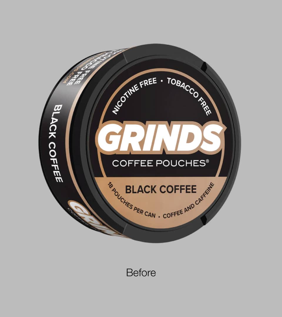
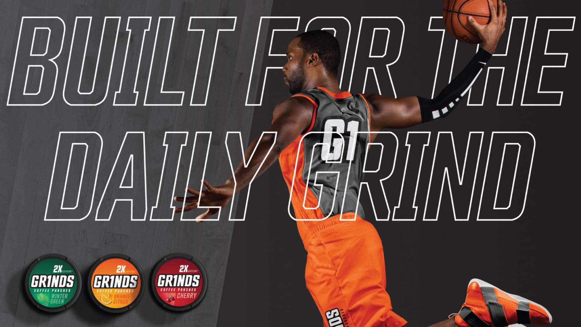
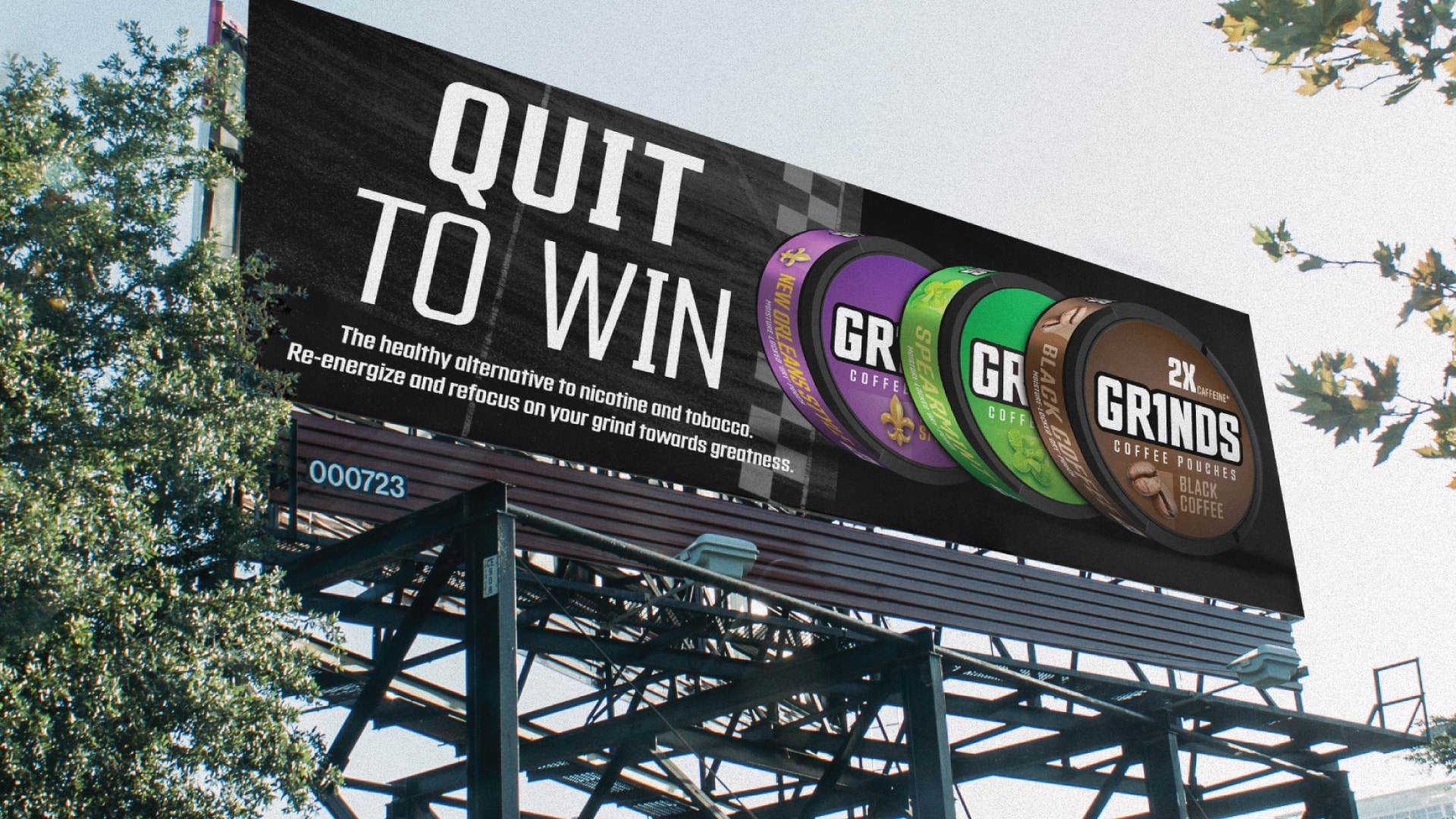
For over a decade, Grinds Coffee Pouches built a loyal following among athletes and everyday consumers looking to quit chewing tobacco and nicotine. But by the time we connected with their team, the brand had a bigger ambition: move beyond the quit-tobacco story and speak to a broader audience around energy, focus, and better sleep. The problem was that the existing positioning and packaging weren’t built to carry that message. The portfolio lacked a clear architecture, and the visual system wasn’t keeping pace with where the brand needed to go.
Our Approach
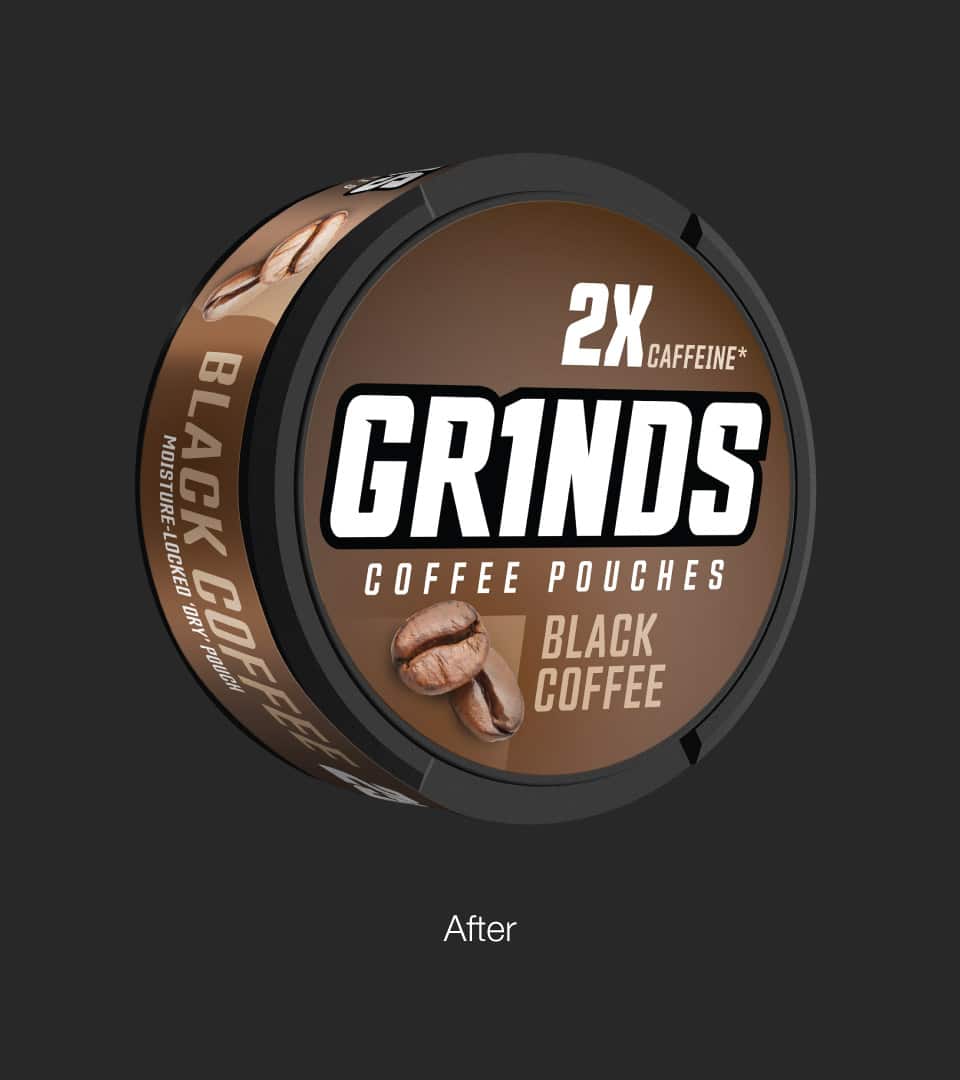
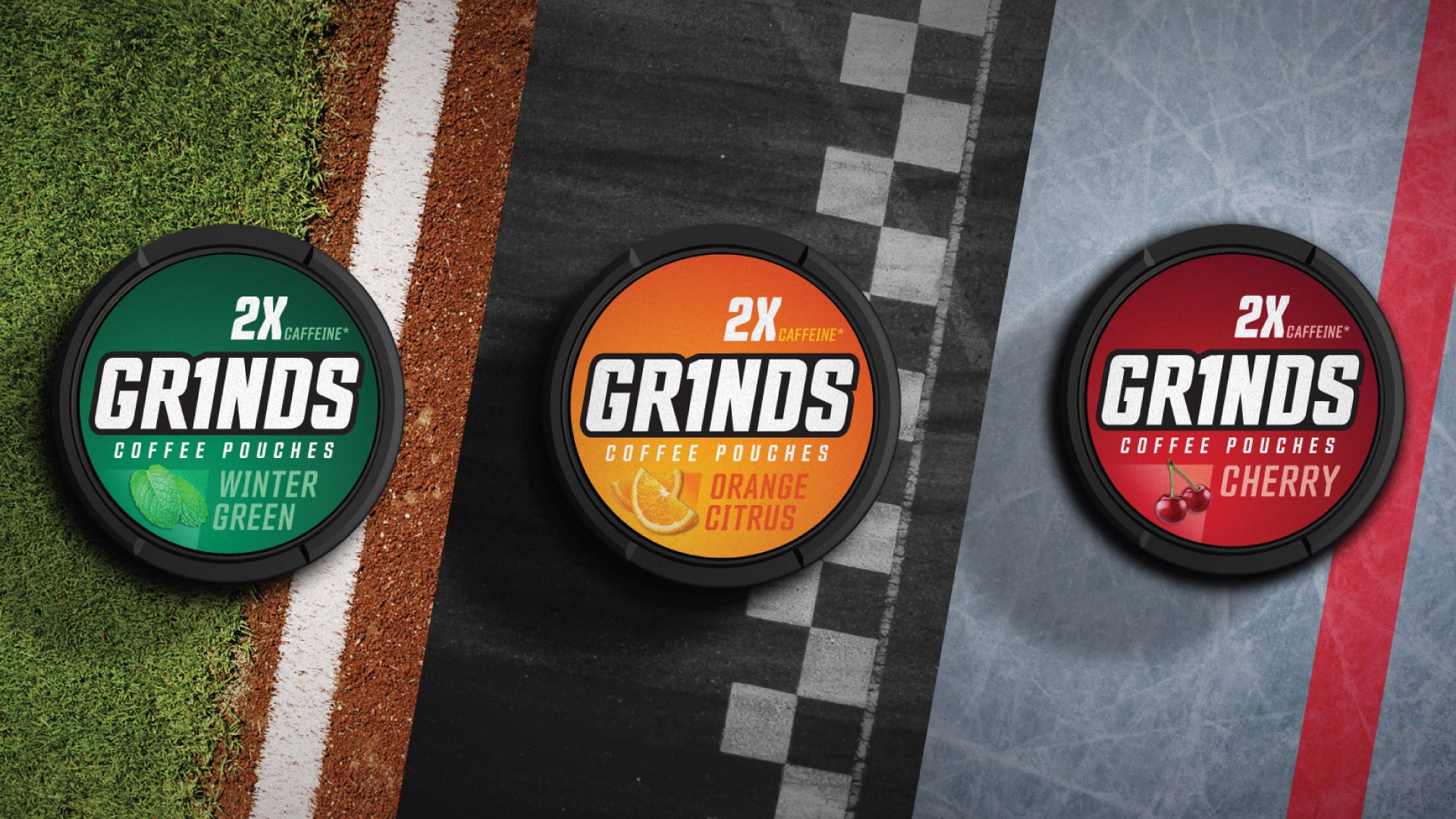
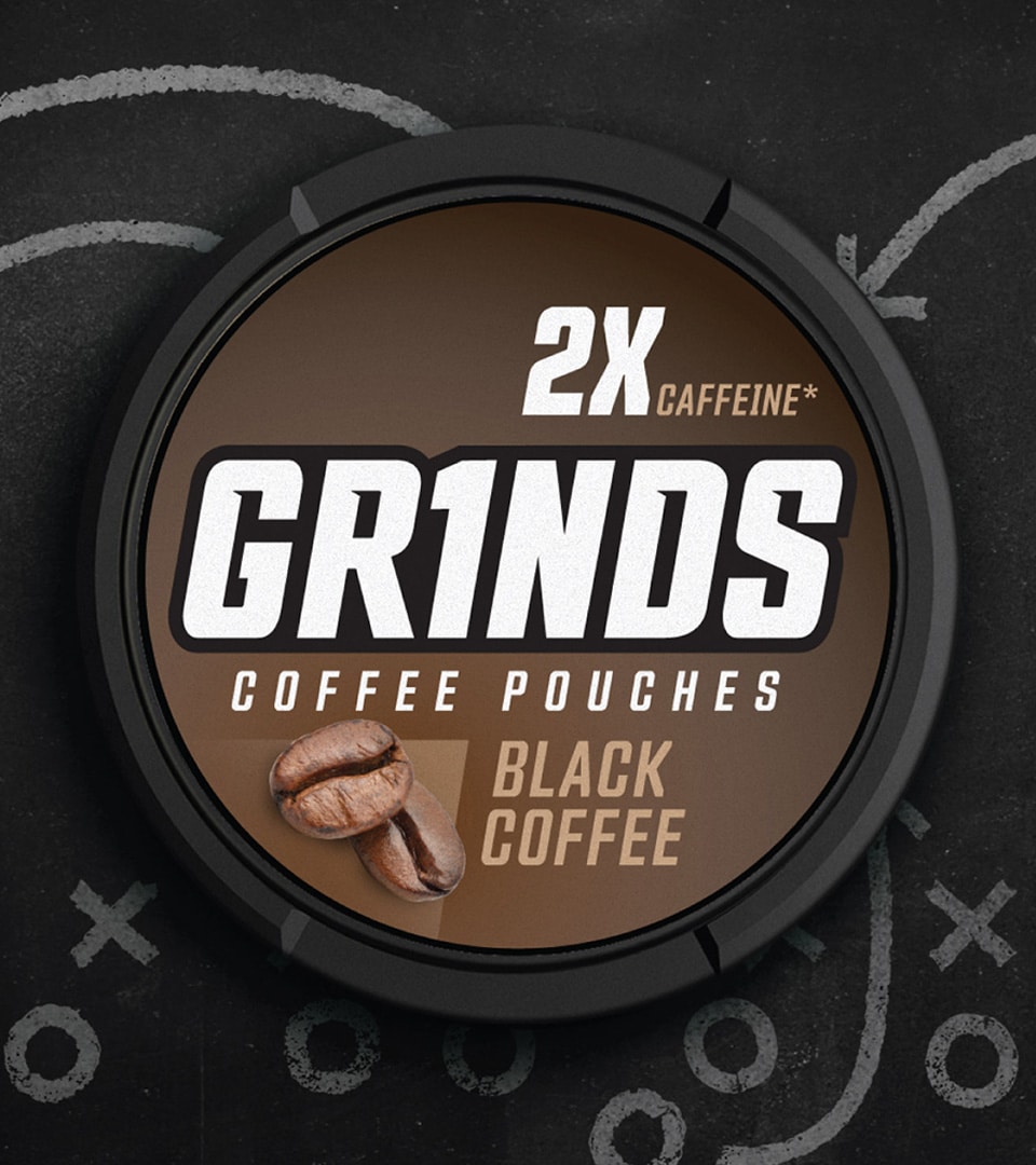
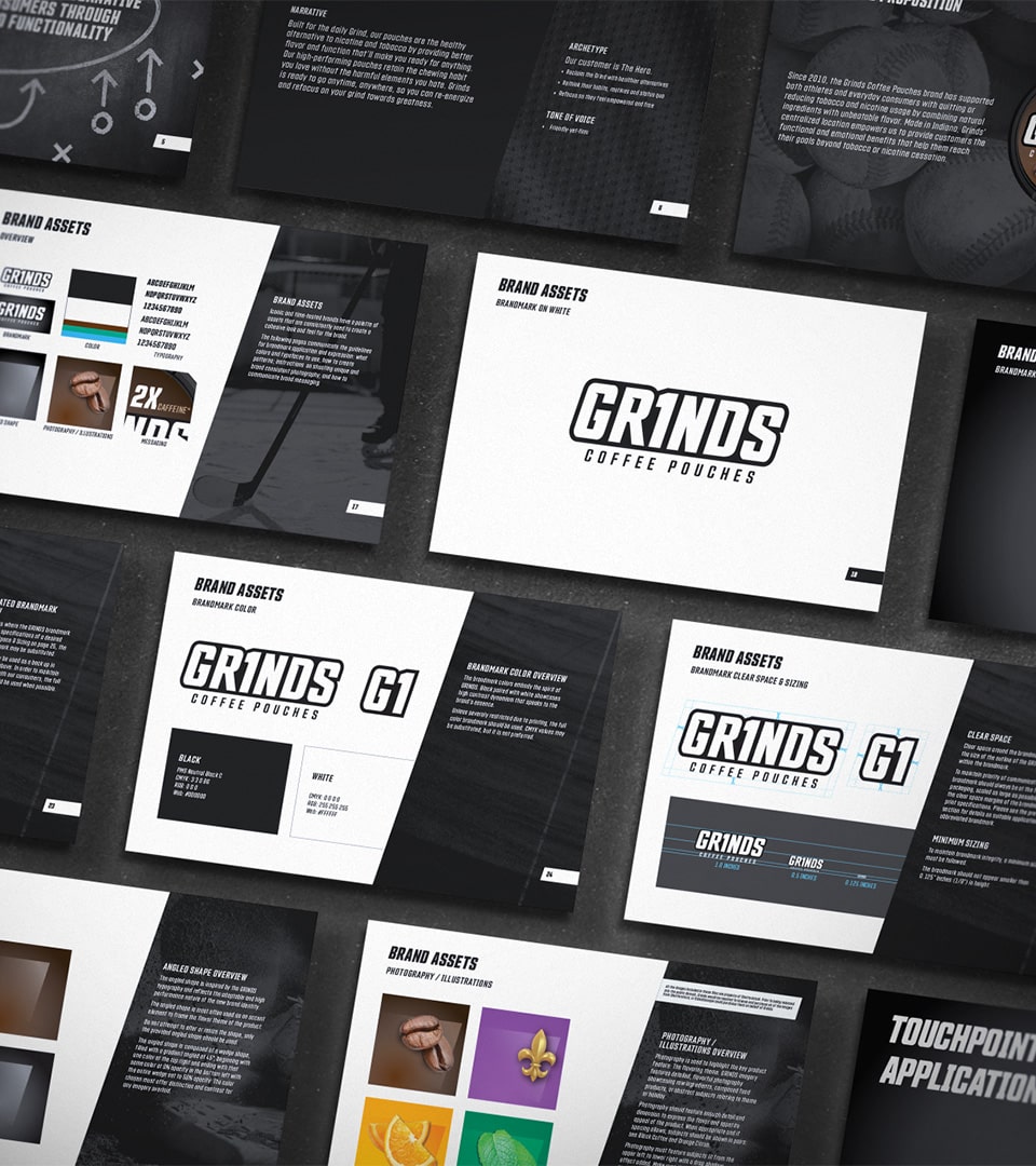
Kaleidoscope began with a collaborative workshop to pressure-test the brand’s direction and identify what was authentically ownable. What emerged was a clear and compelling creative anchor: the stadium. It captured the energy, focus, and performance mindset at the heart of the Grinds brand without feeling forced. From there, we developed a flexible design system and brand architecture that modernized the visual and verbal identity, created a logical portfolio structure, and built in room for future growth across new products and audiences.
The Impact
The result was a brand system built for where Grinds is going, not just where it’s been. Updated positioning and packaging gave the team a platform to reach a broader audience with a stronger, clearer message that Grinds doesn’t just help you quit bad habits. It helps you build better ones.
More Work
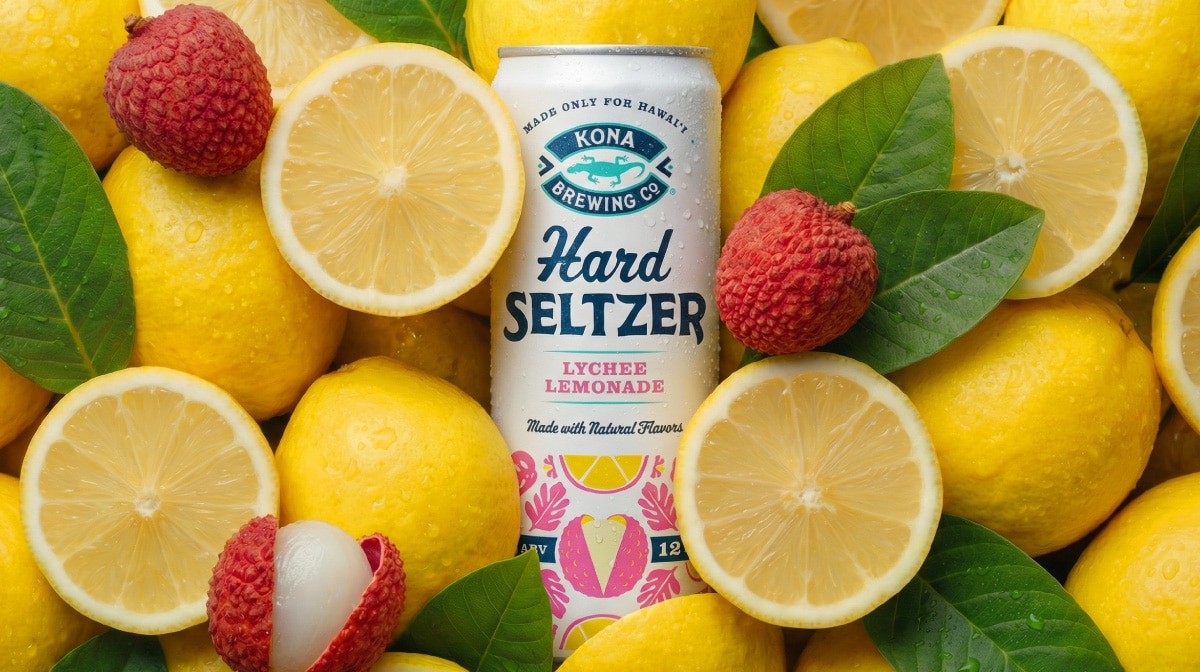
Kona Brewing
Design Strategy・Packaging Design・Visual Identity・Brand World Development
Sun, surf, and something cold. A hard seltzer line with packaging and a brand world built to match.
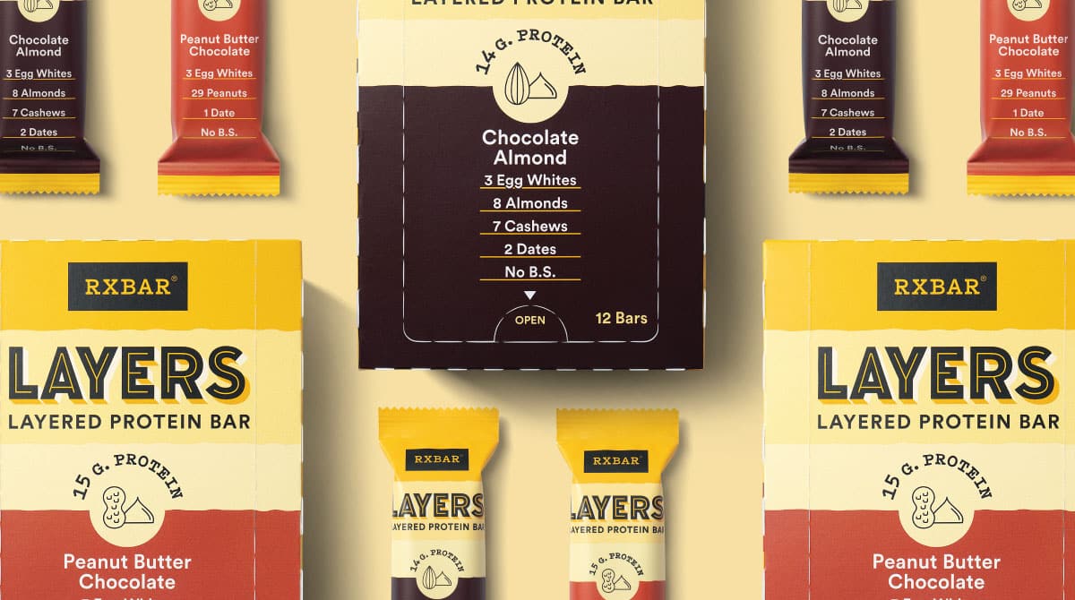
RXBAR Layers
Packaging Design · Design Architecture · Brand Identity · Packaging Prototypes
A brand extension that retained iconic equity while slimming the silhouette for a new indulgent line.
Get In Touch
Let’s Get Started
Every great project starts with a conversation. Have something in mind? Share a few details and let’s explore what we can build together.