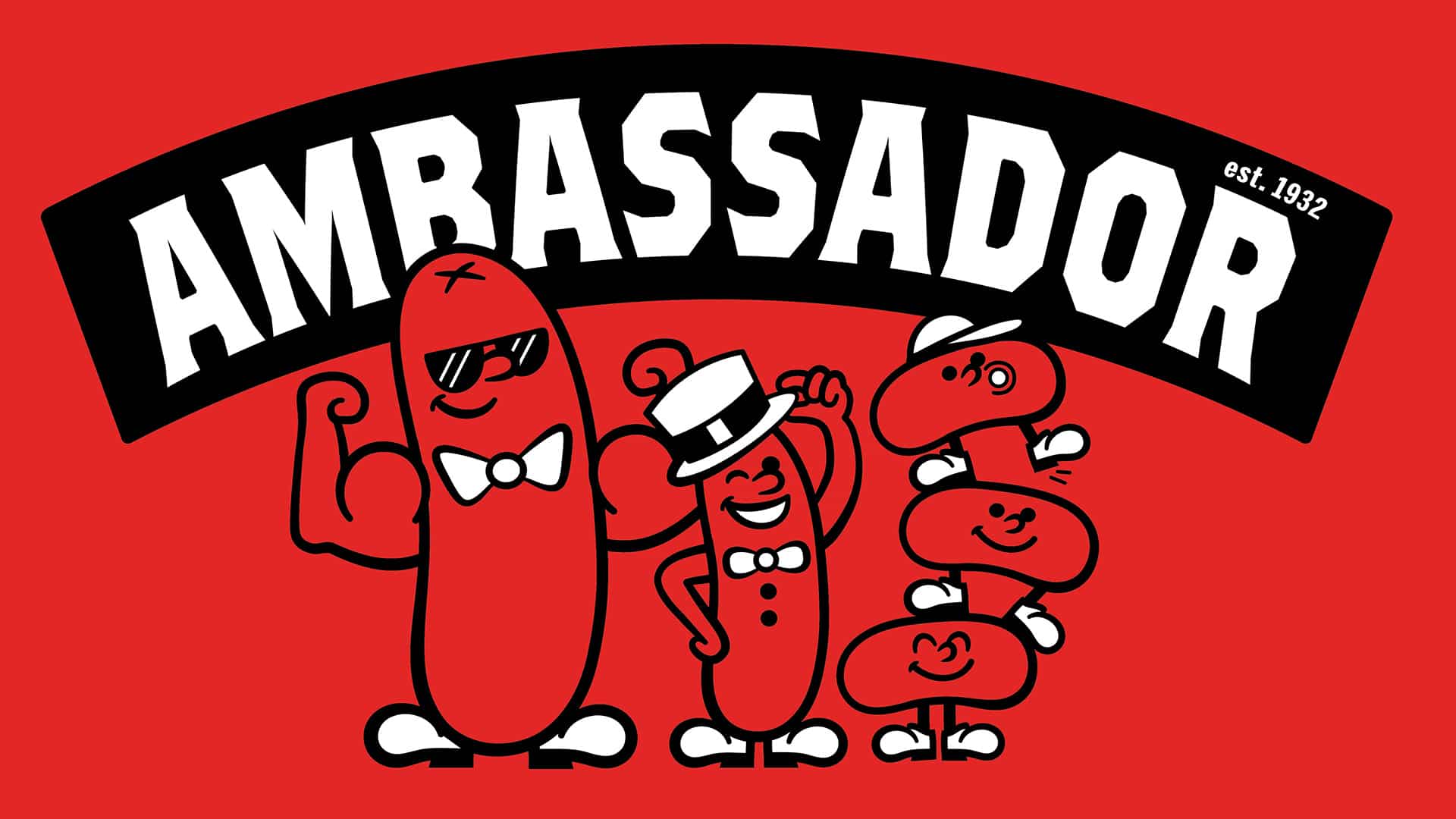
Ambassador
90 Years of Trust. Redesigned for What’s Next.
The Challenge
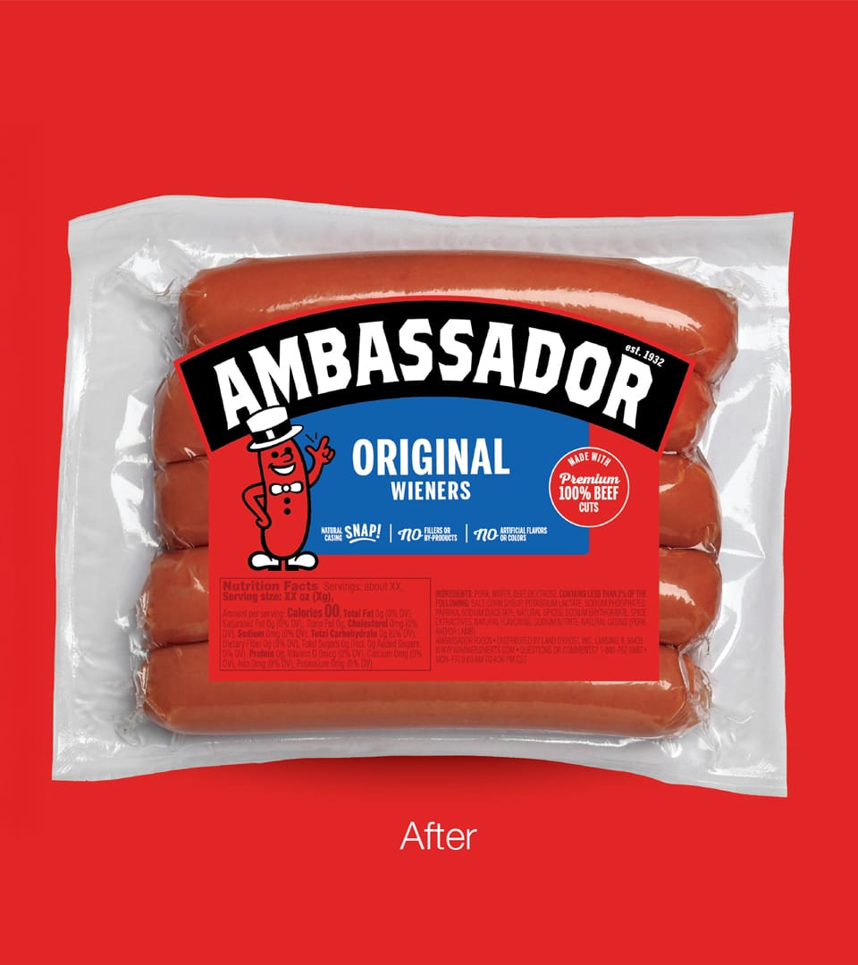
Ambassador is a beloved regional brand built on quality and heritage dating back to 1932. As Land O’Frost prepared to expand beyond its established base, the packaging needed to do something difficult: evolve without losing what made it trusted.
The existing system had grown cluttered, lacking the premium cues today’s shoppers expect and unequipped to compete in new markets. The challenge wasn’t simple modernization. It was selective evolution: identifying which equities were load-bearing and which were ready to change.
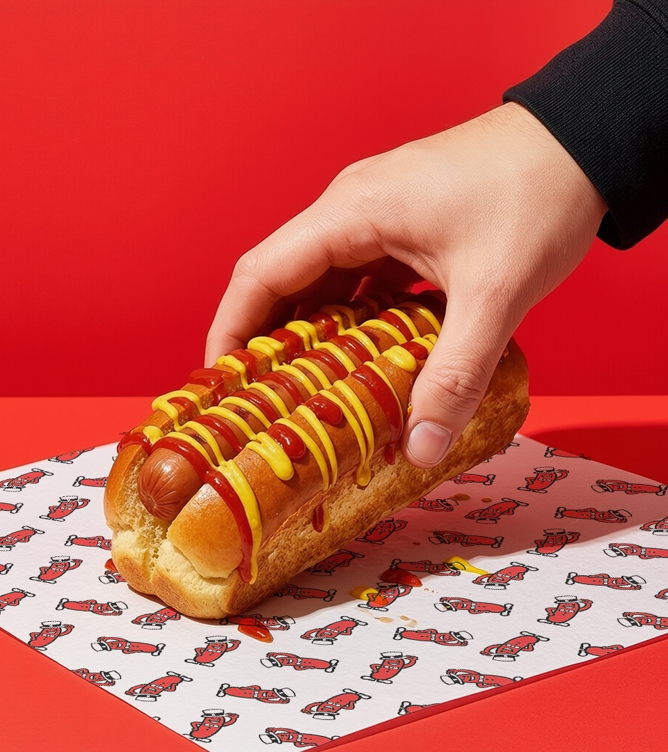
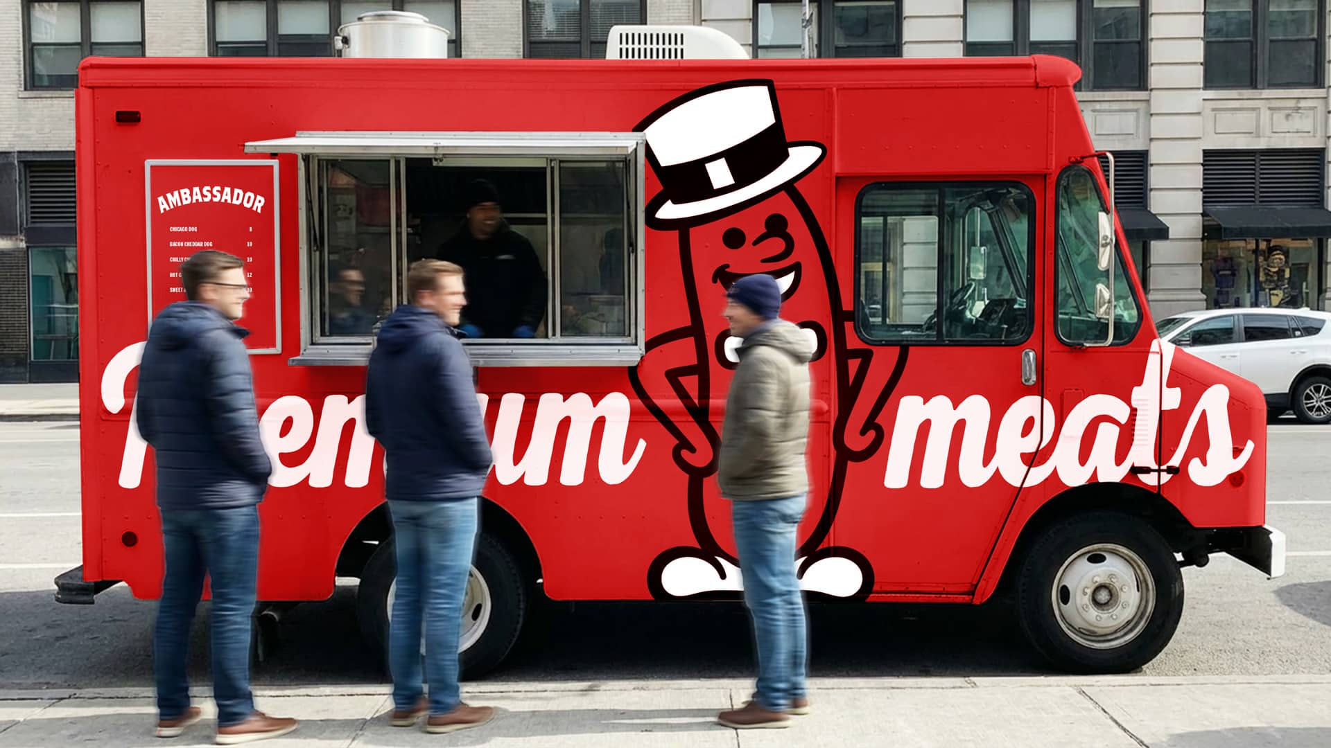
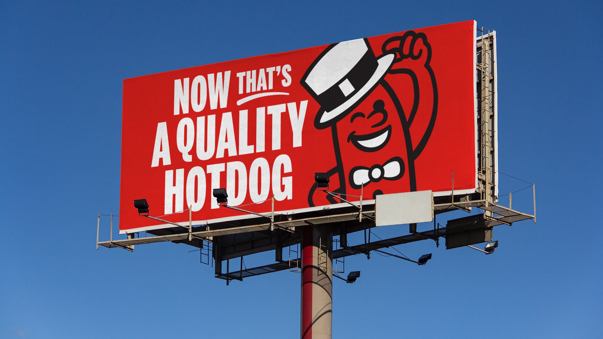
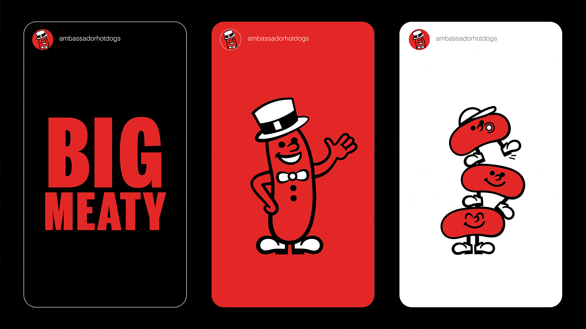
The logo required refinement, not replacement. The iconic “Hotdog Man” needed to be honored and elevated, not erased.


Our Approach
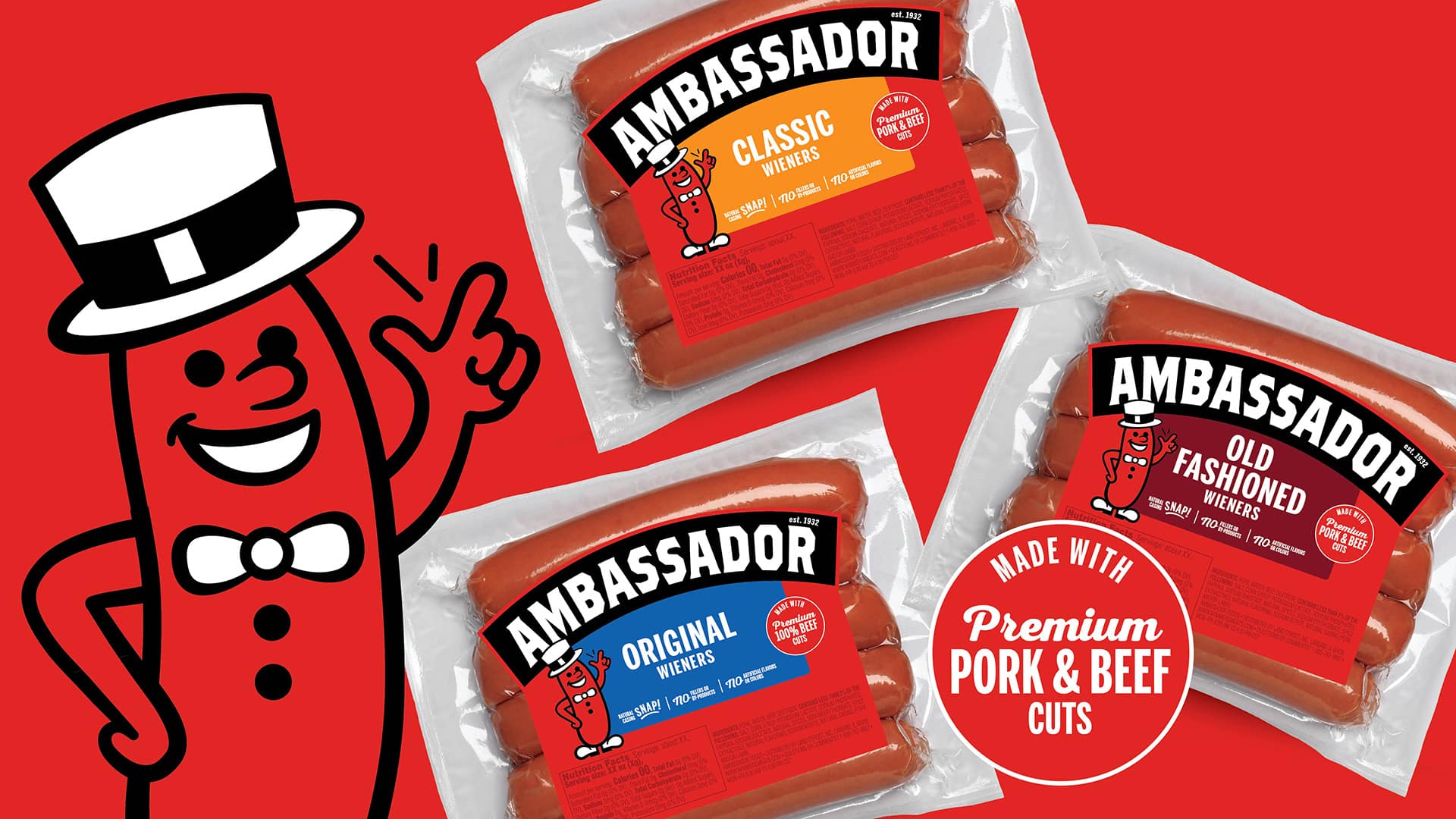
We explored multiple packaging design directions, each stress-tested against two competing imperatives: contemporary premium expression and earned brand recognition.
The design craft was largely one of restraint, knowing precisely what to keep, refine, and leave behind. Core assets were modernized with intention, and concepts were validated through consumer research, with insights directly shaping the final direction.
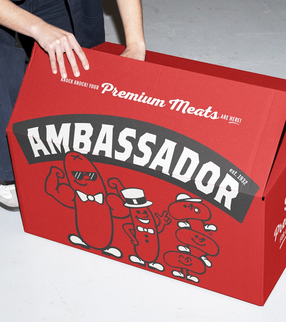
The outcome was a scalable design system built to span the full Ambassador packaging portfolio and support future innovation.


The Impact
Launched Summer 2026, the refreshed Ambassador packaging design delivers stronger shelf presence, clearer communication, and a premium identity built for growth beyond its regional base.
More Work
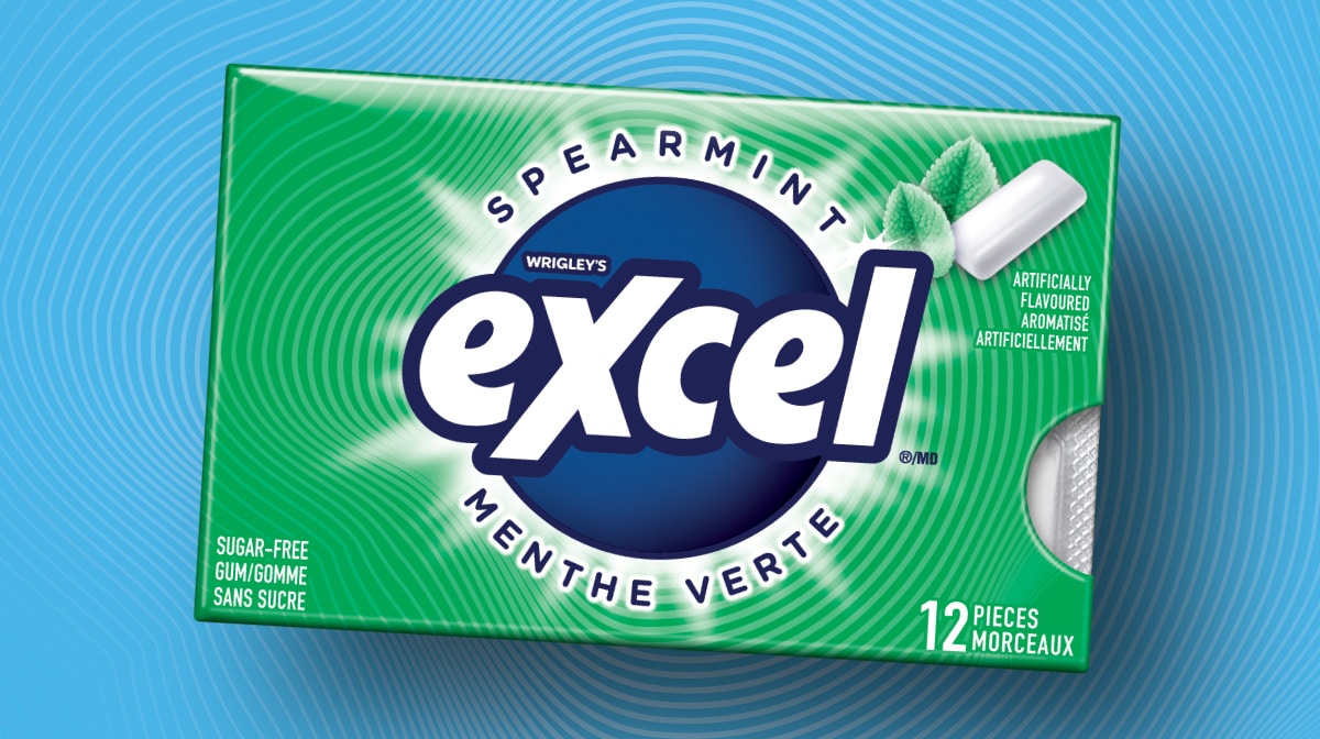
MARS Excel
Packaging Design · Consumer Research · Design System
A Gen Z-targeted redesign for MARS — 40 SKUs, bilingual compliance, and a scalable design system.
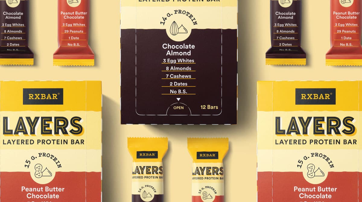
RXBAR Layers
Packaging Design · Design Architecture · Brand Identity · Packaging Prototypes
A brand extension that retained iconic equity while slimming the silhouette for a new indulgent line.
Get In Touch
Let’s Get Started
Every great project starts with a conversation. Have something in mind? Share a few details and let’s explore what we can build together.