Thermos
A Brand Built to Last
The Challenge
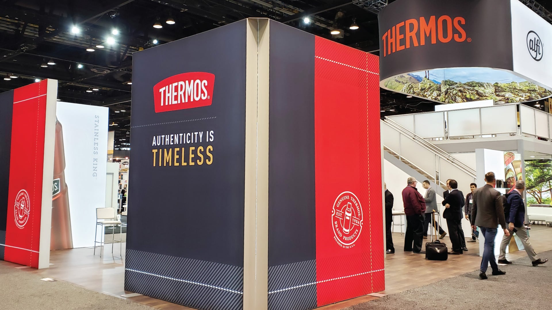
Thermos is one of the rare brands whose name has become the word for the product itself. That kind of cultural penetration is earned over generations, but it can also obscure the real story. The brand’s advantage isn’t just recognition, it’s how its products are designed and built. Thoughtful construction, careful material selection, and engineering precision developed over decades are the foundation of what Thermos actually is. The challenge was making that foundation visible, translating structural excellence into brand equity that consumers could understand and feel.
Our Approach
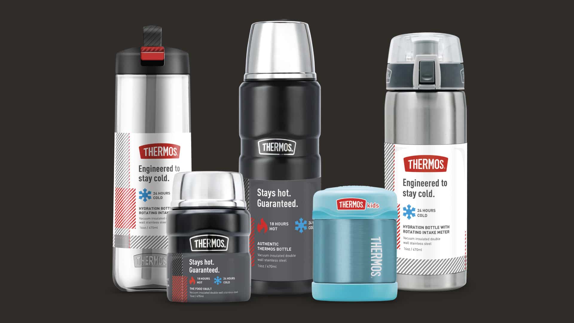
Kaleidoscope supported the work through consumer research, brand asset evaluation, and the development of brand pillars rooted in functional excellence. From that strategic foundation, the prototyping team brought the narrative to life with structural prototypes and product mockups that highlighted key design features and construction details, making the engineering story tangible rather than theoretical.
The Impact
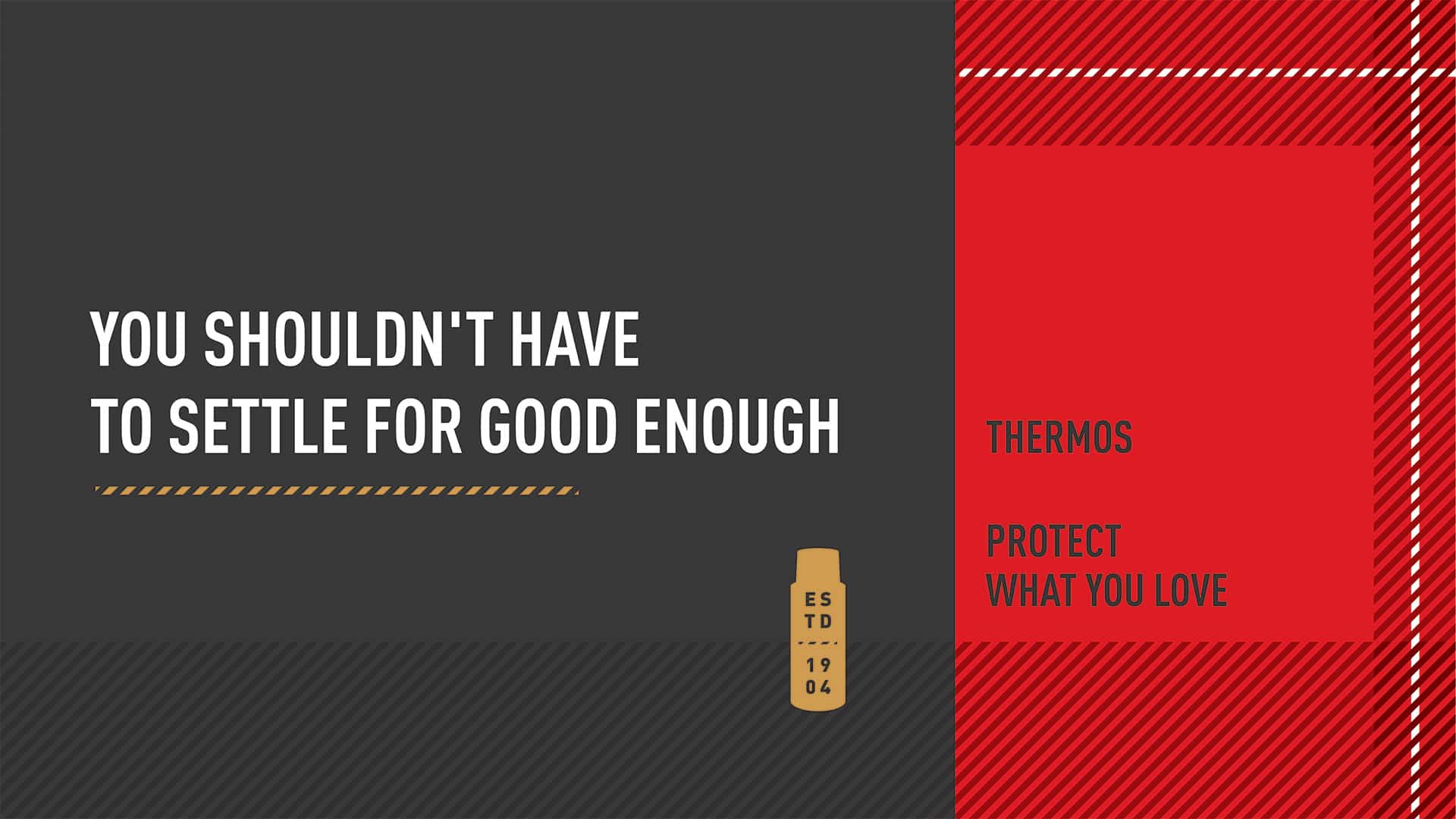
By anchoring Thermos in the physical reality of how its products are made and how they perform, the brand gained a sharper platform for its purpose: to protect what you love. Behind every bottle is a brand defined by design integrity and lasting quality. The work gave Thermos the language and visual evidence to prove it.
More Work
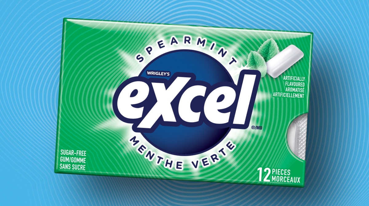
MARS Excel
Packaging Design · Consumer Research · Design System
A Gen Z-targeted redesign for MARS — 40 SKUs, bilingual compliance, and a scalable design system.
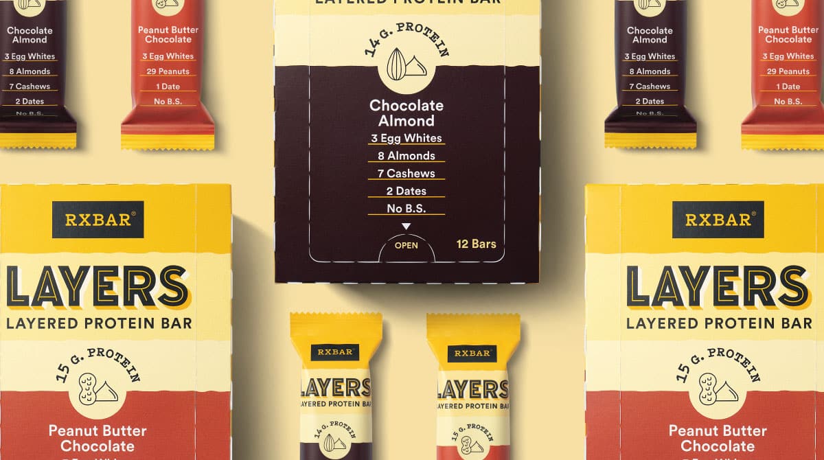
RXBAR Layers
Packaging Design · Design Architecture · Brand Identity · Packaging Prototypes
A brand extension that retained iconic equity while slimming the silhouette for a new indulgent line.