
Dunkin’
A Smile in the Mind and in Your Cup
The Challenge
When Dunkin’ dropped the Donuts from its name, the rebrand wasn’t just a logo change, it was a signal that the brand had grown beyond its original identity. The retail packaging needed to match that ambition. The challenge was threading a needle: modernize the visual system to reflect a broader coffee-forward brand while preserving the familiar, feel-good cues that had made Dunkin’ a staple of American culture. Too far in either direction and the equity disappears.
Our Approach
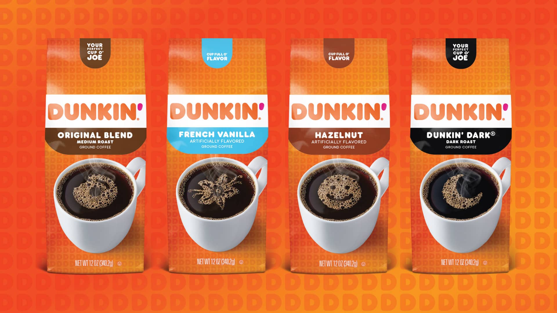
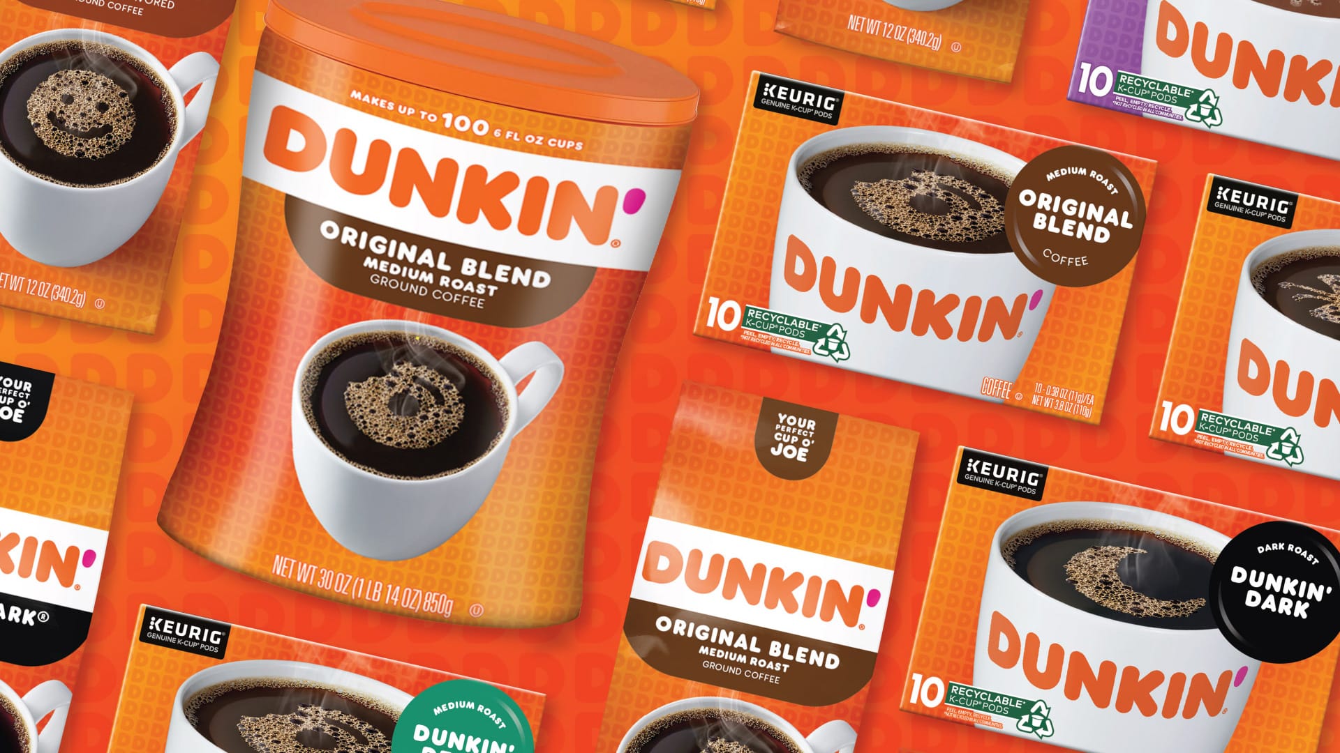
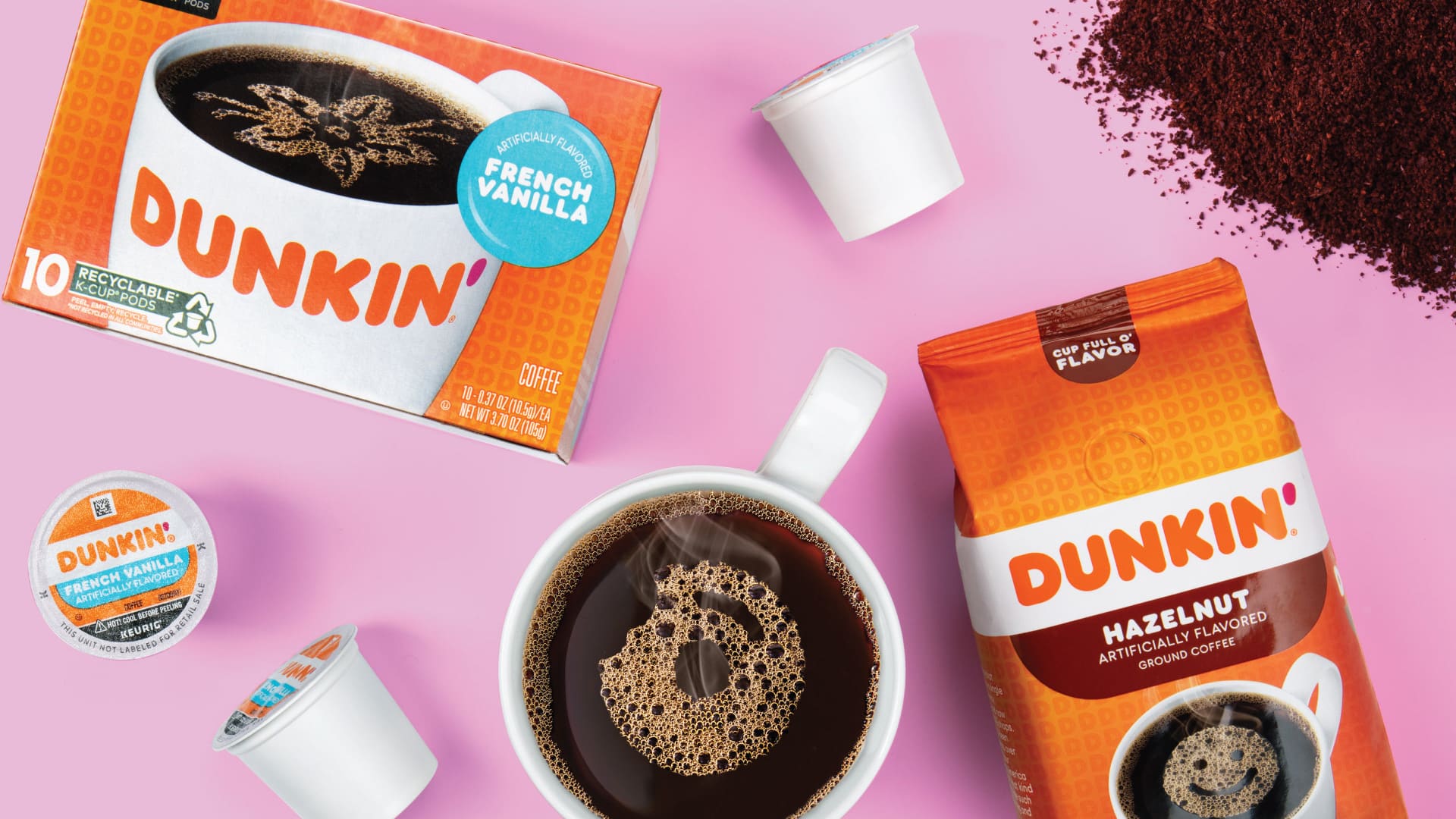
Kaleidoscope developed an ownable illustration style that did two things at once. It conveyed bold appetite appeal and expressed the playful, energetic personality that makes Dunkin’ distinctly Dunkin’. Every design decision was grounded in brand architecture thinking, building a flexible system that could stretch across flavors, formats, and seasonal expressions without losing cohesion. The result wasn’t just a packaging refresh. It was a scalable design platform built for where the brand is going.
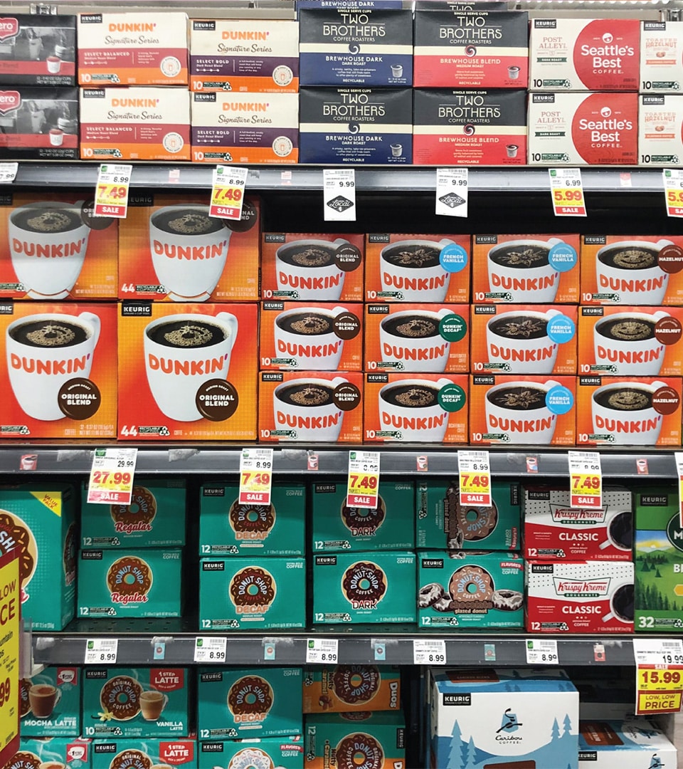
The Impact
The updated retail packaging hit shelves with the confidence of a brand that knows exactly who it is. Bold flavors. Familiar warmth. A consistent visual system that gives Dunkin’ the room to grow while keeping America running.
More Work
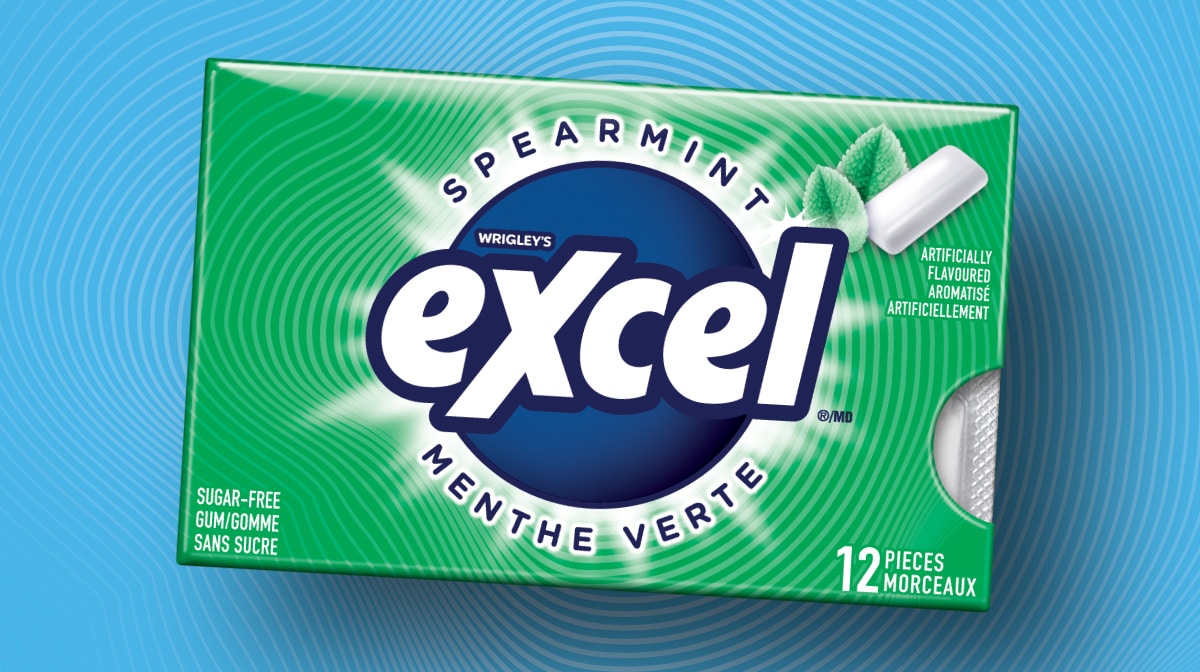
MARS Excel
A Gen Z-targeted redesign for MARS — 40 SKUs, bilingual compliance, and a scalable design system.
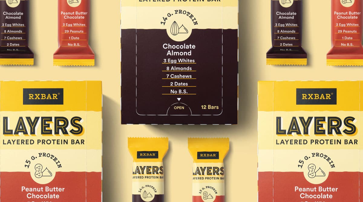
RXBAR Layers
A brand extension that retained iconic equity while slimming the silhouette for a new indulgent line.