
Jenny’s Tofu
Great Food Deserves to be Unmissable
The Challenge
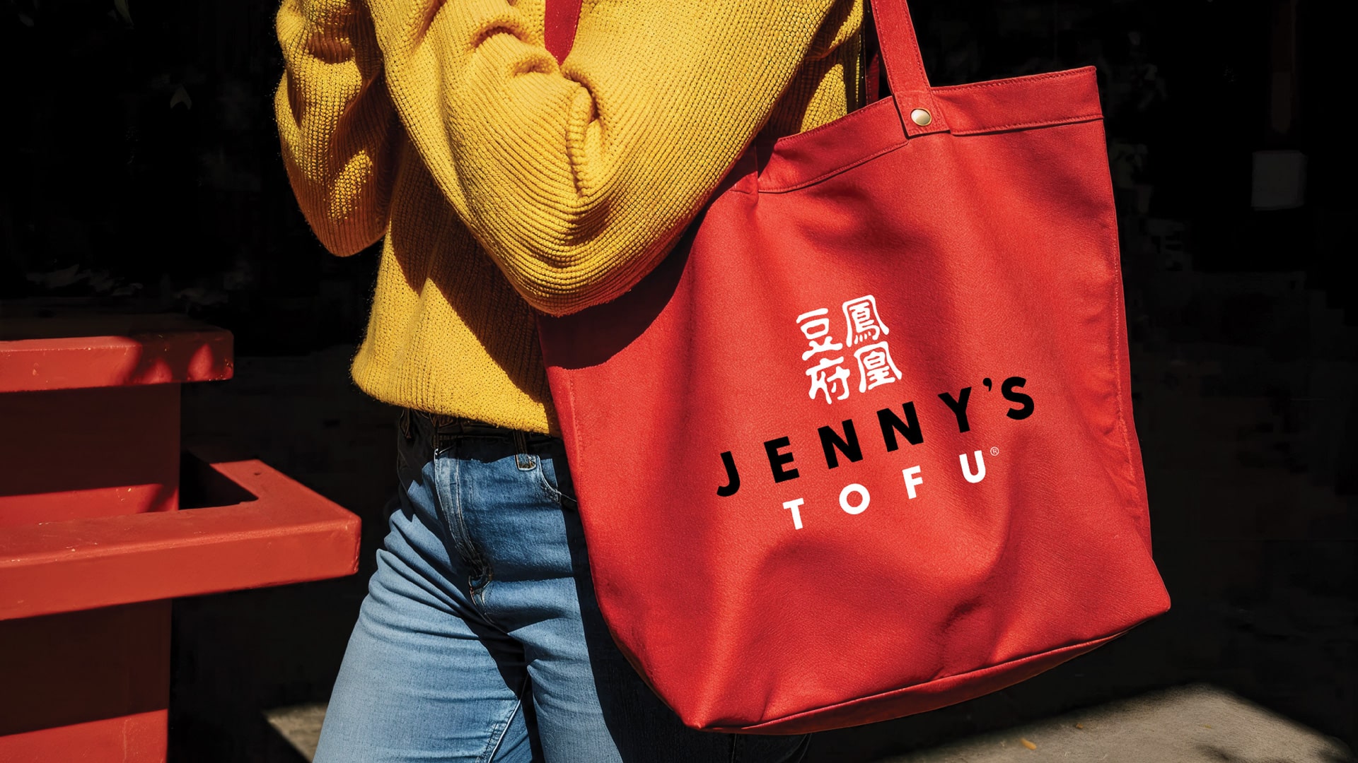
Jenny’s Tofu is a premium tofu brand crafted from organic, Illinois-grown soybeans. As retail distribution expanded, including a key presentation to Whole Foods, the brand needed a more unified packaging system to strengthen shelf presence and reflect its premium positioning.
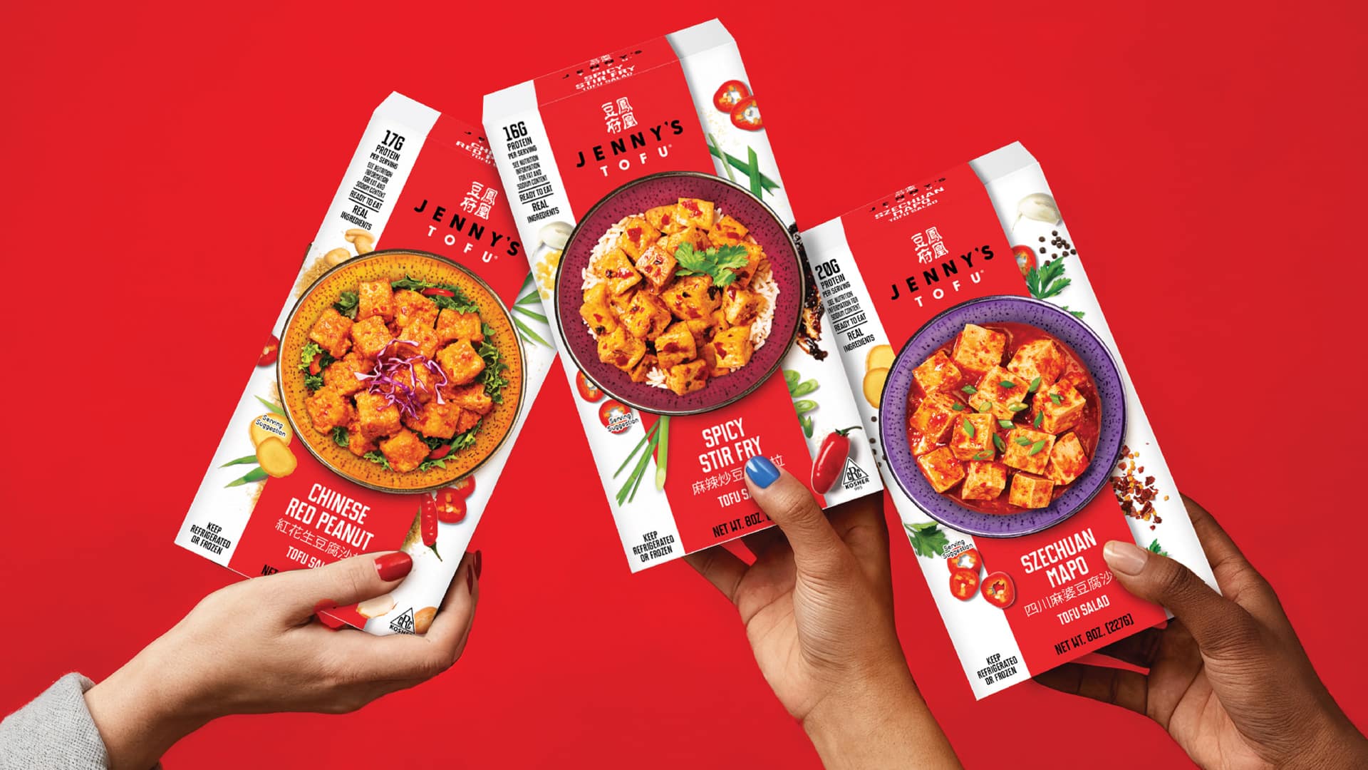
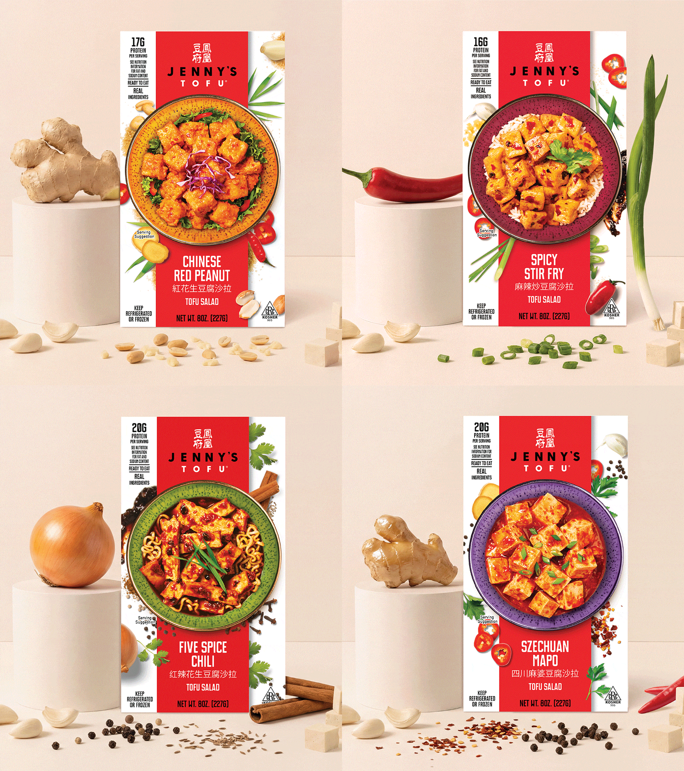
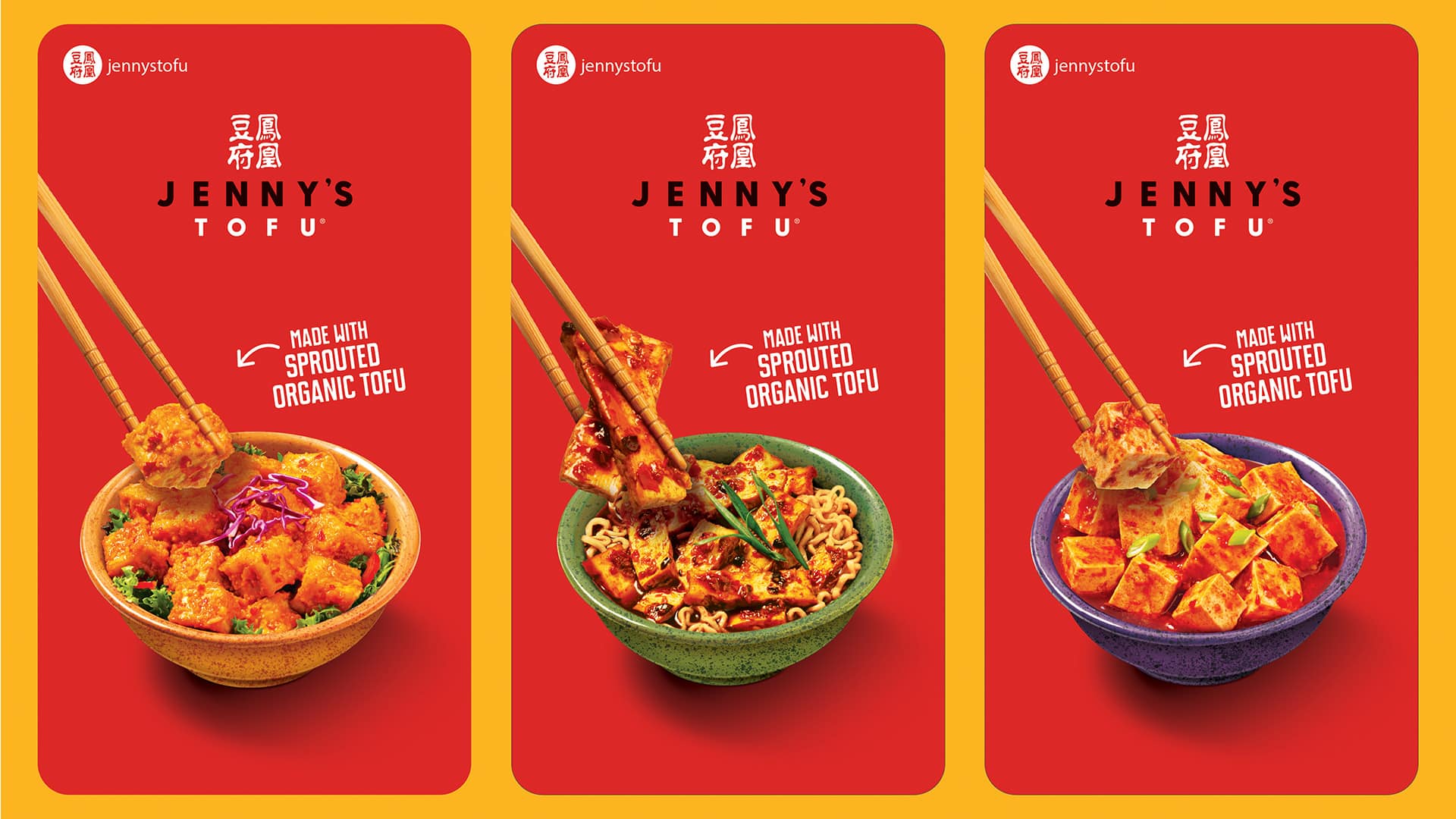
The Tofu Salad was merchandised in a vacuum-sealed pouch with minimal shelf impact, and the design problem was precise: tofu salads and blocks share the same carton size and are routinely shelved side by side. The system needed to distinguish product types through hierarchy and communication structure without fragmenting the brand’s premium identity.
Our Approach
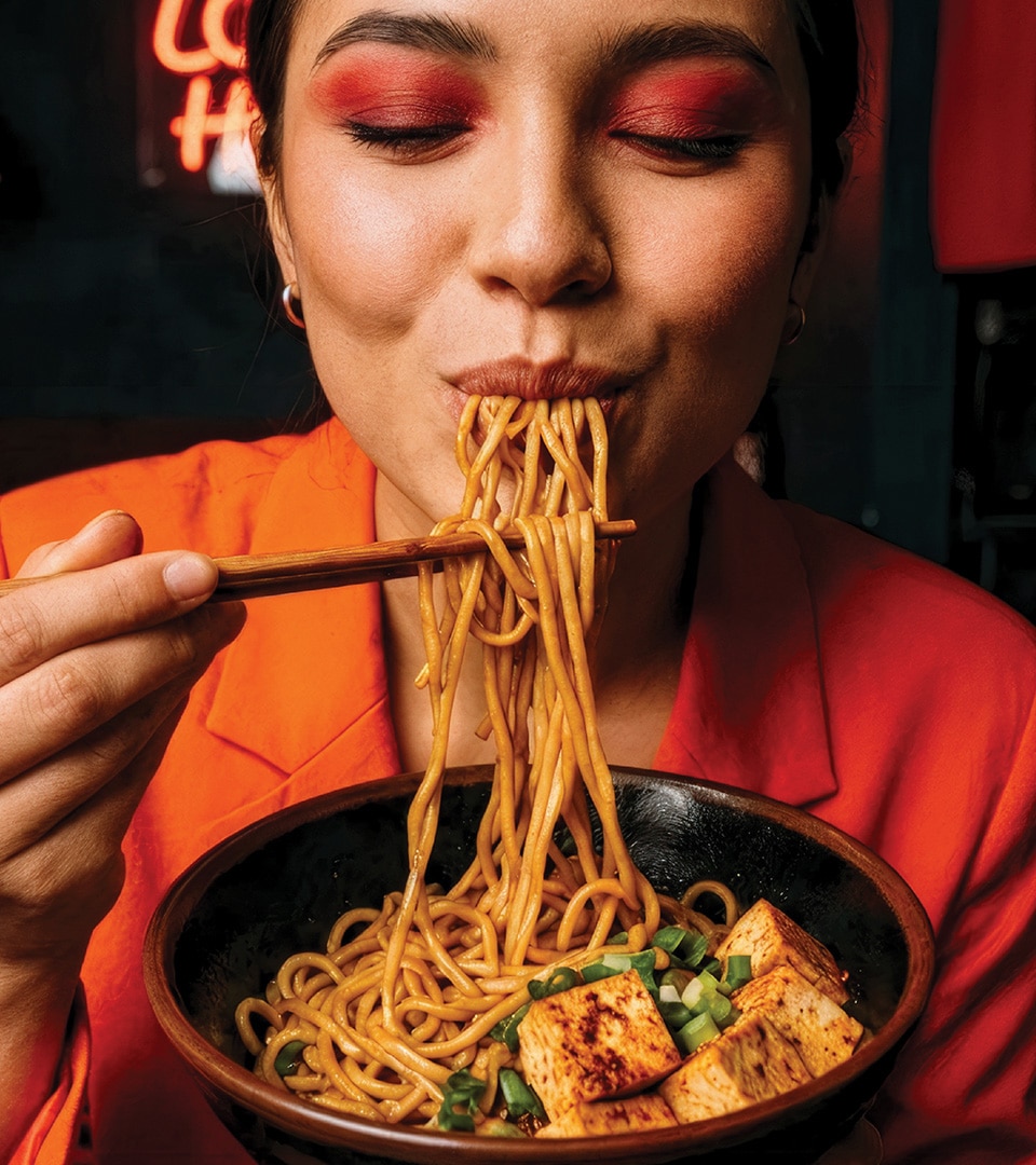
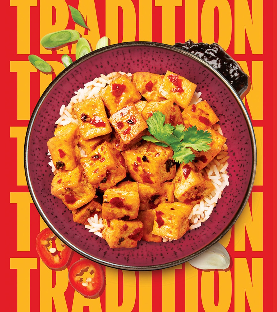
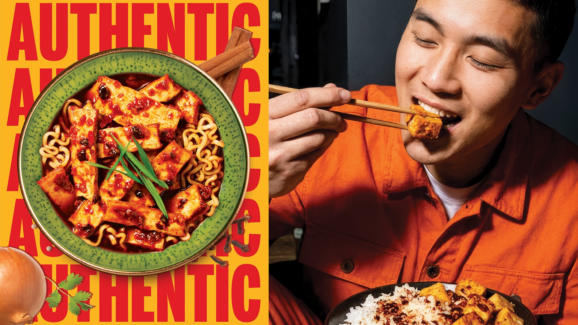
We developed a premium packaging design concept built around stronger visual hierarchy, elevating product photography, sharpening flavor cues through typography and color, and creating clear differentiation language across the shelf set. Every decision was made with shopability and retail readiness in mind to ensure the Tofu Salad could hold its own against adjacent products while reading unmistakably as part of the Jenny’s Tofu family.
The Impact
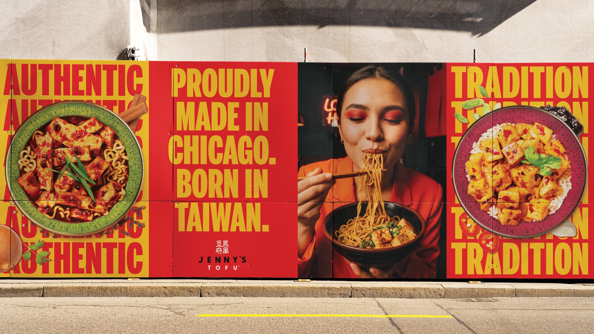
A shelf-ready packaging system that solves a precise merchandising problem, giving the brand the visual authority to compete in natural and specialty retail while strengthening Jenny’s Tofu’s premium positioning ahead of expanded distribution.
More Work
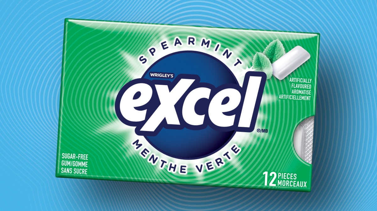
MARS Excel
A Gen Z-targeted redesign for MARS — 40 SKUs, bilingual compliance, and a scalable design system.
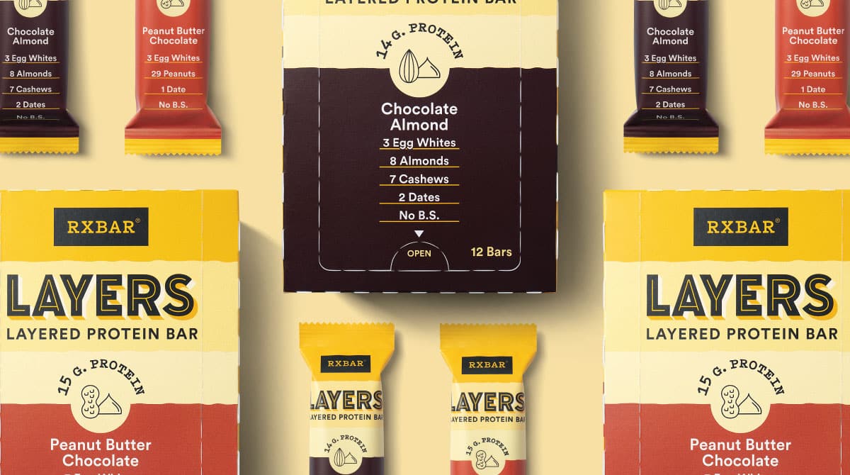
RXBAR Layers
A brand extension that retained iconic equity while slimming the silhouette for a new indulgent line.