
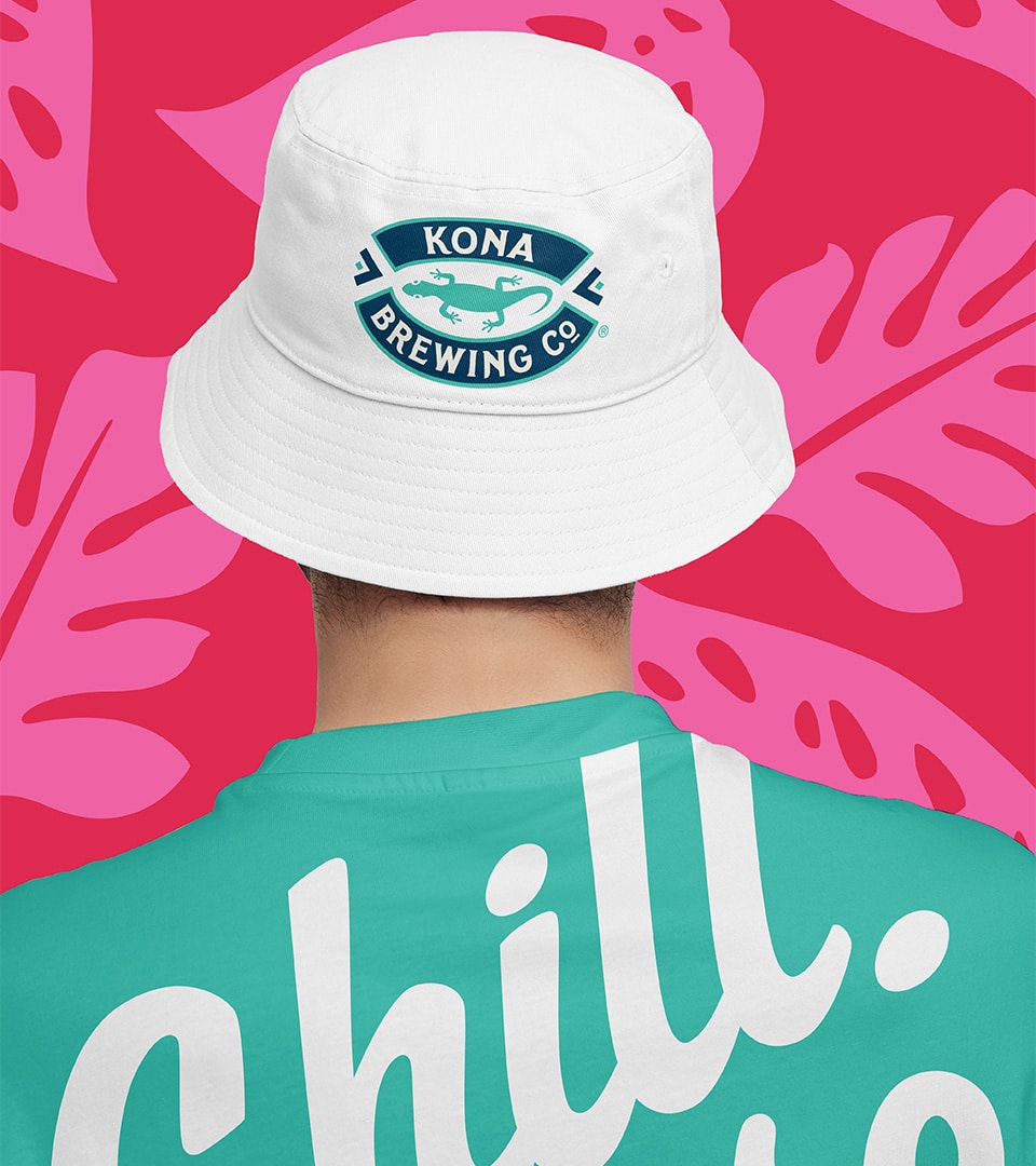
Kona Brewing Hard Seltzer
Same Family, Different Energy
The Challenge
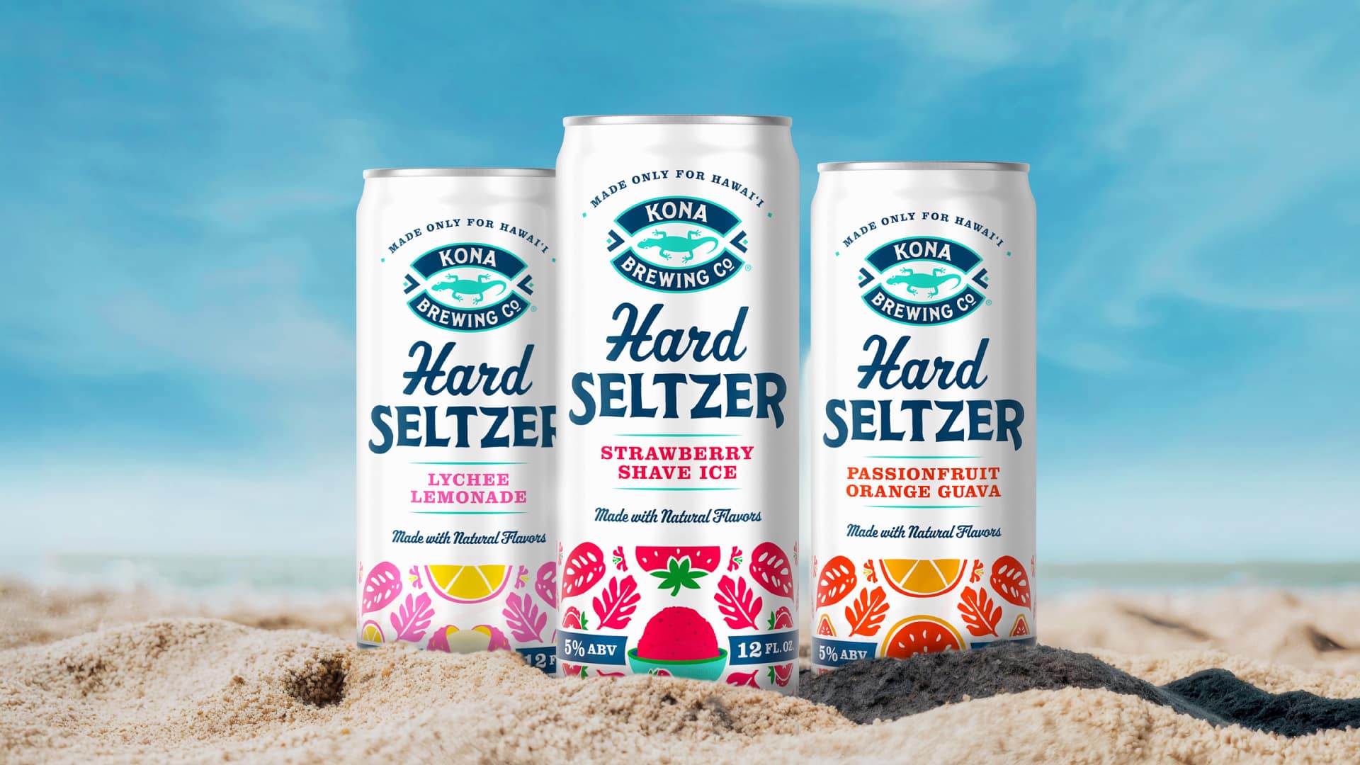
In 2023, Kona Brewing Co. left the hard seltzer category. The islands kept drinking. Just not Kona. With White Claw and Maui Brewing Co. filling the void, it was time to come back swinging. Not with a refresh, not with a relaunch. Something entirely new. A Hard Seltzer that had never existed before, created from the ground up to earn its place in the market and make one thing crystal clear: this one is Kona.
Our Approach
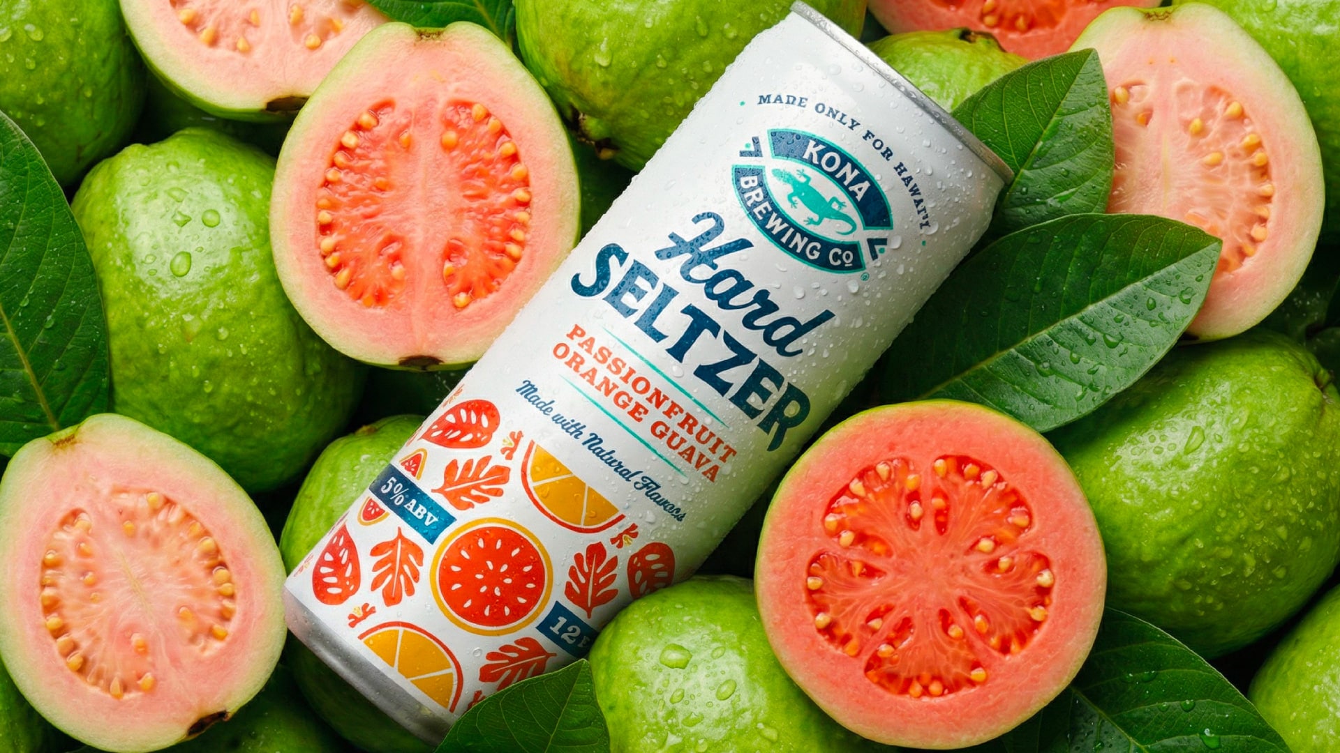
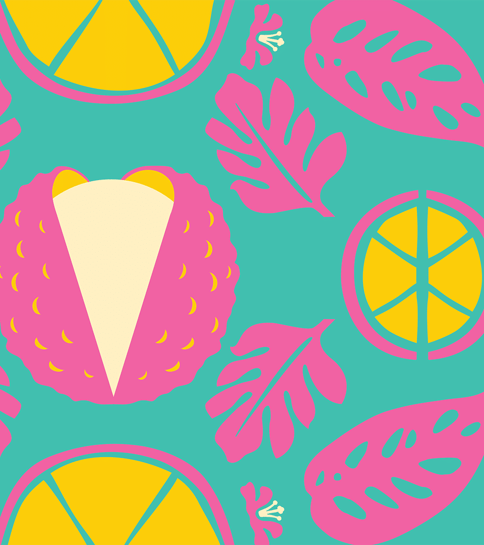
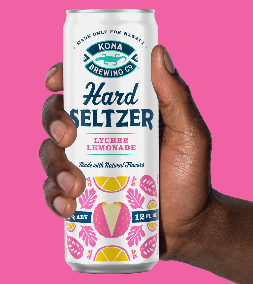
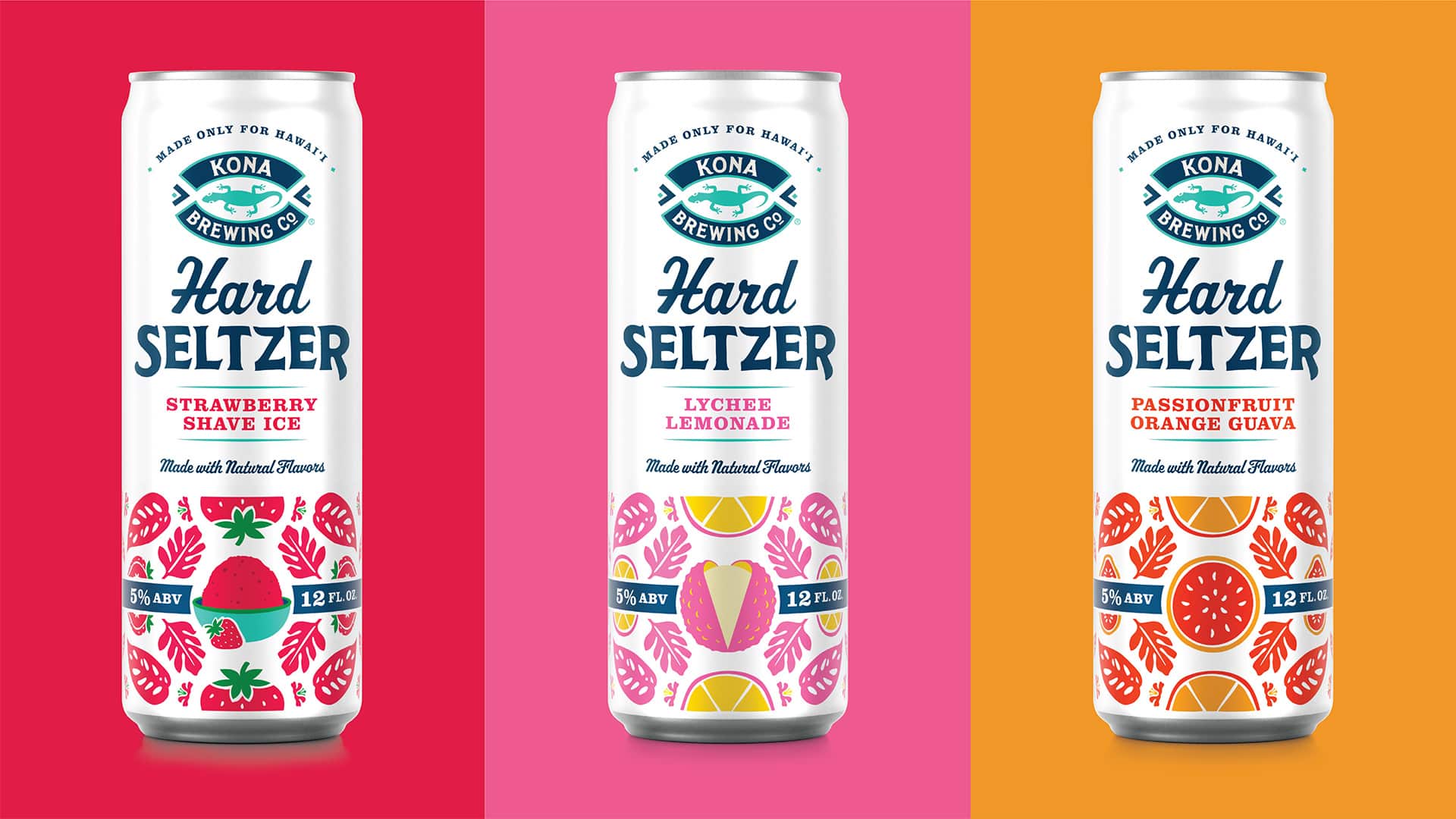
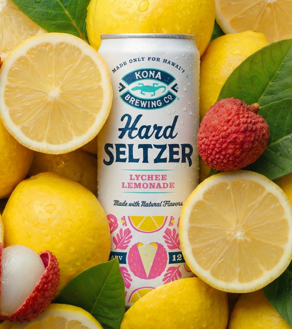
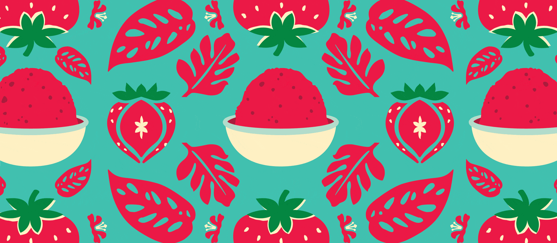
The challenge wasn’t just designing a new product. It was designing the right relationship. Kona Brewing Co. is an icon in the islands, beloved for its beer. The Hard Seltzer needed to feel like a natural extension of that world: a younger sibling, same family, different energy. We built a visual identity that shares Kona’s warmth and craft credibility while carving out its own space. A bold fruit illustration system, rooted in flavors that are genuinely Hawaiian, not just tropical-adjacent, gives each SKU its own personality while holding together as a cohesive family. Clean white packaging keeps the line feeling light and refreshing, while the graphic energy makes it unmistakably its own. “Made Only for Hawaiʻi” isn’t a tagline. It’s the product’s reason for being.


The Impact
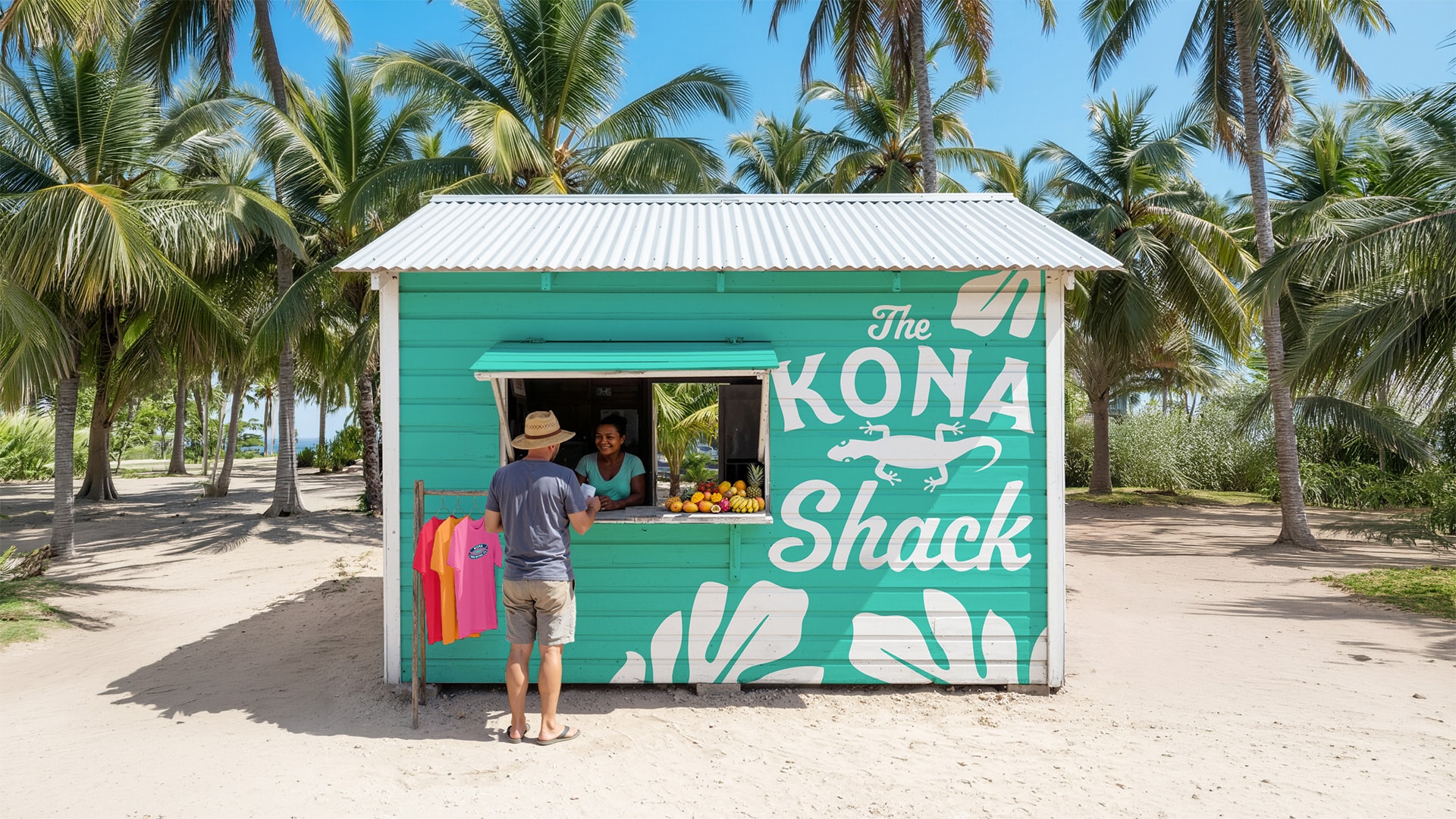
The result is a line that earns its place in the Kona family while staking out new territory. It looks like Hawaiʻi feels, relaxed, colorful, specific, and carries that energy far beyond the can, extending naturally into lifestyle, merch, and environmental applications. When a brand is genuinely rooted somewhere, the design doesn’t have to explain it. It just radiates.
More Work
MARS Excel
Packaging Design · Consumer Research · Design System
A Gen Z-targeted redesign for MARS — 40 SKUs, bilingual compliance, and a scalable design system.
RXBAR Layers
Packaging Design · Design Architecture · Brand Identity · Packaging Prototypes
A brand extension that retained iconic equity while slimming the silhouette for a new indulgent line.